Picture this: You have a perfect vibe, the lighting is cinematic, but as soon as the camera pans, your logo starts re-typesetting itself and the texture turns to noise. That is the reality of mastering Seedance 2.0 without a safety net. Dealing with identity drift and motion corruption is the bane of every AI video creator’s existence, even as industry reports confirm that ByteDance shows impressive progress in AI video.
I’m Millie, and I’ve spent the last few sprints breaking (and fixing) prompts to understand exactly why this happens. The secret isn’t just better source images—it’s mastering the art of prompt constraints and knowing precisely which negative cues to deploy. Here is our diagnostic workflow to lock down your motion and keep your videos on-brand, frame after frame.
The 4 failure modes — what you’re actually seeing
Most of us describe the problem like: “It drifted,” “It got crunchy,” “It stopped looking like our product,” or “The motion is cursed.”
In practice, we kept seeing the same four failure modes.
1) Identity drift (the “that’s… not our bottle anymore” problem)
You’ll notice it in:
- logos warping
- labels re-typesetting themselves
- faces becoming a cousin of the person
- product silhouettes subtly changing every few frames
What’s happening: The foundational AI models are trying to stay consistent while keeping the generation novel. If we don’t explicitly tell it what must not change, the model will “helpfully” redesign elements.
2) Style drift (your clean ad turns into a mini music video)
Symptoms:
- lighting jumps (warm → cool)
- materials change (matte → glossy)
- the scene becomes more cinematic than brand-safe
What’s happening: we under-specified art direction, or we described it once and then asked for motion that implies a different camera/lighting setup.
3) Motion corruption (the “rubber limbs + jelly camera” look)
Symptoms:
- micro-shakes
- stuttery pans
- object bends that should be rigid
- a camera move that starts smooth and ends like a handheld sprint
What’s happening: motion gets underconstrained, so the model fills in gaps with whatever movement pattern it’s most confident in.
4) Temporal detail collapse (the “frame 1 is great, frame 20 is soup” slide)
Symptoms:
- sharp → blurry over time
- text becomes unreadable mid-clip
- repeating textures (fabric, wood grain) turn into noise
What’s happening: the model can “spend” detail early, then loses the thread as it tries to maintain coherence across frames. Constraints help, but sometimes the source asset is the real culprit (we’ll hit that later).
If we can label the failure mode in 10 seconds, we can usually fix it in 2–3 iterations instead of 12.
Constraint rules that stabilize outputs
Think of constraints like taping down the corners of a sketch before you start shading. You’re not limiting creativity, you’re stopping the paper from sliding.
Here are the constraint rules we keep reusing to build a stable Seedance 2.0 prompt. We’ll write them in plain English so you can steal them. (If you are completely new to the interface, review the basics of how to use Seedance 2.0 first).
Motion constraints
If we don’t specify motion precisely, Seedance will invent motion. And the invented motion is… sometimes a choice.
What works:
- Define one primary camera move.
- Define the speed.
- Define what must remain stable.
Copy-paste starter (adjust to taste):
- Prompt: “Slow, smooth dolly-in (no shake), 3–5% camera movement, locked horizon, subject stays centered.”
More motion constraints we use a lot:
- “Tripod-stable shot, no camera movement, only subtle subject motion.”
- “Left-to-right pan, constant speed, no acceleration, no jitter.”
- “Micro parallax only, background remains static.”
- “No motion blur, crisp edges.”
When we do want handheld energy (rare for brand work), we still constrain it:
- “Handheld feel but controlled: gentle sway only, no jolts, no warping.”
Style lock constraints
Style drift happens when we describe a vibe, not an art direction.
We’ve had better luck treating style like a checklist:
- lighting
- lens look
- color
- texture realism
- render type (photoreal vs. illustration)
Copy-paste starter:
- Prompt: “Photoreal product ad, softbox lighting from camera-left, neutral white balance, clean studio backdrop, true-to-life materials, no film grain, no stylization.”
If you’re matching existing brand content, call that out:
- “Match the reference image lighting and color exactly.”
- “Keep the same background tone and contrast as the input.”
Small tip that saved us time: if we want “cinematic,” we add guardrails so cinematic doesn’t become “noisy.”
- “Cinematic lighting, but still commercial-clean: no heavy grain, no harsh shadows, no crushed blacks.”
Identity lock constraints
This is the big one for designers.
We want the model to animate, not redesign.
Identity locks we use:
- “Do not change the product silhouette.”
- “Label text stays readable and unchanged.”
- “Logo remains sharp, same shape and placement.”
- “Do not add extra elements.”
Copy-paste starter:
- Prompt: “Keep the exact same bottle shape, label layout, and logo. No redesign. No new text. Maintain brand colors exactly.”
If you’re animating a person:
- “Same person identity across all frames: facial structure, skin tone, hairstyle unchanged.”
And if the tool supports it in your workflow, we also keep runs repeatable:
- Seed: Use a fixed seed when you’re iterating on constraints (so you can tell what changed because of the prompt, not because the generation rolled different dice).
We’re being intentionally bossy here. Seedance behaves better when we are.
Negative prompt patterns that actually help
Negative prompts are like saying, “Yes, but don’t do that thing you always do.”
We avoid giant negative lists. They can backfire or just get ignored.
Instead, we use short “pattern blockers” tied to the failure modes.
Here are the negative prompt patterns that kept helping us:
For motion corruption
- “no jitter, no shake, no wobble”
- “no warping, no bending, no elastic deformation”
- “no temporal flicker”
For text + logo survival
- “no garbled text, no distorted typography”
- “no logo morphing, no re-drawing”
For style stability
- “no cartoon, no anime, no illustration” (if you want photoreal)
- “no heavy film grain, no noisy texture”
- “no dramatic color shifts”
For keeping the scene clean
- “no extra objects, no props added, no background changes”
A practical combo we’ve used on packaging shots:
- Prompt: “Photoreal studio product shot, softbox lighting, slow dolly-in, keep label perfectly readable.”
- Negative: “no jitter, no warping, no garbled text, no logo morphing, no added props, no color shift”
- Seed: 23117 (example, pick one and stick to it while iterating)
One more honesty note: negative prompts don’t always “fix” text. They often just reduce how often it breaks. For critical typography, we plan to overlay text in post or keep the motion minimal.

Diagnostic flow: symptom → cause → fix
This is the flow we use when a clip goes weird. We literally call it out in Slack like: “Okay, it’s identity drift, not style drift.”
Symptom: logo warps or label changes
Likely cause: missing identity lock + too much motion near the label.
Fix:
- Add identity locks: “logo unchanged, label layout unchanged, text readable.”
- Reduce motion: tripod or very slow dolly.
- Add negatives: “no garbled text, no logo morphing.”
- If it still fails: plan for post (mask/track the label) or use a cleaner source image.
Symptom: clip starts great then degrades
Likely cause: temporal detail collapse.
Fix:
- Shorten the action: “subtle movement only.”
- Ask for fewer simultaneous changes (don’t do pan + rotation + lighting shift).
- Add: “crisp edges, consistent sharpness.”
- Keep Seed fixed while testing.
Symptom: camera movement looks stuttery or handheld (but you didn’t ask for it)
Likely cause: motion underconstrained.
Fix:
- Specify one camera move + speed: “smooth dolly-in, constant speed, no shake.”
- Add negatives: “no jitter, no wobble.”
Symptom: colors change or lighting flips
Likely cause: style drift.
Fix:
- Lock white balance + lighting direction.
- Add: “match reference exactly.”
- Add negatives: “no color shift.”
Symptom: object bends that should be rigid (bottles, phones, furniture)
Likely cause: model treating it like a soft object under motion.
Fix:
- Add: “rigid object, hard edges, no deformation.”
- Simplify motion.
If we had to pick one rule: diagnose first, then constrain. Otherwise we’re just typing feelings into a prompt box.

When constraints aren’t enough (asset-side issues)
Sometimes the prompt is fine. The asset is the problem.
We saw this a lot with:
- low-res logos
- JPEG artifacts around type
- thin strokes on labels
- busy patterns (tiny text, micro-geometry)
The model can’t preserve detail that isn’t really there.
When to fix the source image instead of re-prompting
We stop re-prompting and fix the input when:
- the label is already slightly blurry at 100%
- the logo edges are crunchy (compression halos)
- the product cutout has fringing
- reflections are messy and undefined
Quick asset fixes that actually helped us:
- Upscale the source image (a clean upscale, not just “make it bigger”).
- Re-export the label as a higher-res texture (if it’s your packaging).
- Increase contrast on key edges slightly so the silhouette reads.
- Simplify the background (busy backgrounds invite hallucinated motion).
And for teams: keep a “Seedance-ready” folder of hero assets.
- One clean front shot
- One 3/4 angle
- One high-res label/logo pack
You’ll feel the difference immediately.
We are constantly refining our models to reduce temporal collapse. Try these advanced prompting techniques on PromeAI and let us know how the stability compares to your current workflow.
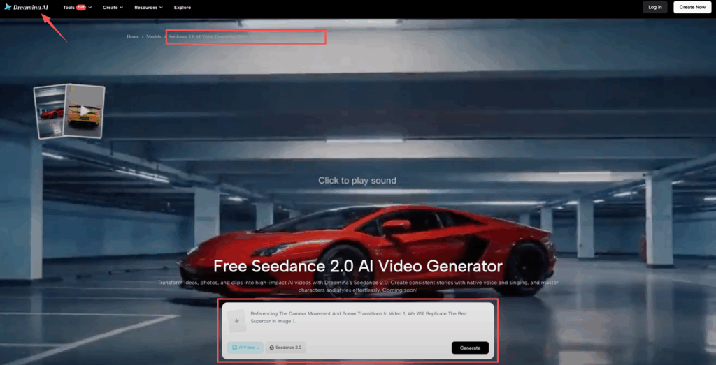
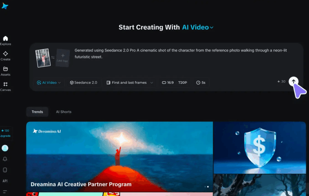
If you want a place to start experimenting, Dreamina’s Seedance 2.0 tool page is here: Seedance 2.0 in Dreamina.
One last thing we’d add for credibility on your own blog or studio site: include an author box. Something like:
About the author: Millie is an AI explorer and design consultant who tests creative tools in real client workflows (brand packaging, product launches, and marketing sprints). She focuses on fast, repeatable prompting patterns, especially the boring constraint stuff that makes outputs usable.
Okay, your turn: where do you usually get stuck, identity drift, motion wobble, or the “frame 20 turns to soup” problem?
Seedance 2.0 Prompt Constraints: FAQs
What are Seedance 2.0 prompt constraints, and why do they matter?
Seedance 2.0 prompt constraints are explicit rules that tell the model what must stay fixed (identity, style, motion, detail) while it animates. Without constraints, the model “improvises,” causing drift, wobble, or blur. Strong constraints reduce prompt roulette and make iterations faster and repeatable.
Why does Seedance 2.0 change my product logo or label even with the same prompt and image?
That’s usually identity drift: the model tries to add novelty and may “redesign” logos, labels, or silhouettes unless you forbid changes. Add identity locks like “logo unchanged,” “label layout unchanged,” and “no new text,” then reduce motion near the label and include negatives like “no garbled text, no logo morphing.”
How do I stop motion wobble or “jelly camera” in Seedance 2.0 videos?
Motion corruption often comes from underconstrained movement. Specify one primary camera move, a constant speed, and stability rules—e.g., “slow smooth dolly-in, 3–5% movement, locked horizon, no shake.” Reinforce with negative prompts such as “no jitter, no wobble, no warping, no temporal flicker” for cleaner, brand-safe motion.
What causes the “frame 20 turns to soup” problem in Seedance 2.0, and how can I fix it?
That’s temporal detail collapse: the clip starts sharp, then loses coherence and fine detail over time (text, textures, edges). Fix it by shortening the action, limiting simultaneous changes (avoid pan + rotation + lighting shift), and adding “crisp edges, consistent sharpness.” Keep the seed fixed while testing so you can judge constraint changes reliably.
How do I prevent style drift (lighting and color shifts) when using Seedance 2.0 prompt constraints?
Style drift happens when you describe a vibe instead of concrete art direction. Lock lighting direction, white balance, lens/render look, and material realism—e.g., “photoreal product ad, softbox camera-left, neutral white balance, true-to-life materials.” Add “match the reference image lighting and color exactly” plus negatives like “no dramatic color shifts, no heavy film grain.”
Recommended Reads
Leave a Reply