
I’ve spent more hours than I’d like to admit staring at 200% zooms of fabric textures, trying to decide if an AI just “hallucinated” a new pattern onto a client’s sofa.
Hi, I’m Millie, and my obsession with detail is exactly why I put the PromeAI upscaler through the ringer. We’ve used it on everything from luxury product shots to massive site banners to see where it shines and where it stumbles.
If you’re tired of “garbage in, stylish garbage out,” this guide covers my personal “recipe” for using PromeAI’s AI image upscaler to get print-ready quality without the late-night re-render headache.
Upscale Types Explained
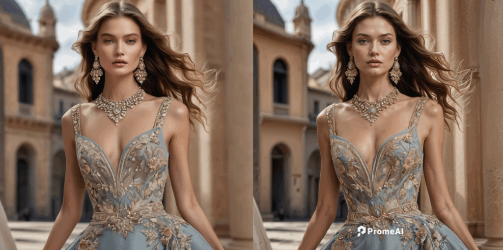
PromeAI‘s AI image upscaler basically gives us two core choices: 2x and 4x. On paper, that sounds simple. In real projects, this choice can save or wreck an image.
2x vs 4x comparison
Here’s how we think about it in real work:
We reach for 2x upscale when:
- The original is already decent quality (clean edges, low noise)
- We just need to go from web → small print or social → slide deck
- We care more about natural texture than “super sharpened” detail
Typical use cases:
- Product thumbnails we want to reuse as A4 pitch deck images
- Architectural renders that are already 2000–3000px on the long side
- Portraits where we hate the “over-processed” look
We reach for 4x upscale when:
- The original is small but clean (e.g., 1000–1500px, not heavily compressed)
- We need big prints or high-res crops
- We know we’ll do extra retouching after
Best use cases we’ve found:
- Key visuals for large prints (posters, roll-ups, trade show panels)
- Hero images on landing pages where zoom or parallax is used
- Detailed product shots with clear edges (packaging, tech, furniture)
A simple rule we keep pinned on our wall:
- 2x = safer, more natural, great for general use
- 4x = bigger leap, great for print and tight crops, but needs more checking
Quality vs speed
PromeAI’s upscaling is pretty quick, but there is a trade-off in practice.
In our tests:
- 2x upscale felt almost “instant” for normal web-to-print needs
- 4x upscale took a bit longer, especially on large source files, but still totally usable in a client rush
How we decide under time pressure:
- For live client presentations or internal mocks, we go 2x. Fast, safe, good enough.
- For finals and print, we plan a few extra minutes and go 4x, then do a quick quality check pass.
Speed tip we’ve learned the hard way: if we’re not sure 4x will hold, we run both 2x and 4x, compare them side by side at 100%, and keep the one that survives the zoom test.
You can try this directly on PromeAI’s image upscaler page and literally just toggle between outputs in your viewer.
Artifact Checklist
The AI is great at detail recovery and texture sharpening, but if we push it too hard, it starts hallucinating little lies. We’ve built a mini checklist for catching that before the printer or client does.
What to watch for
When we inspect a PromeAI upscale, we zoom to 100–200% and look for:
– Over-sharpened skin Faces start to look waxy or crispy, like someone overdid a skin-smoothing filter then sharpened it.
– Weird edges Text or product edges get jagged or “haloed” (bright outline, dark outline).
– Fabric and texture lies Clothing or furniture textures repeat in a too-perfect pattern, or fabric starts to look like CG. This is a common issue we’ve learned about from understanding why AI image upscalers introduce weird textures in fabric.
– Logo + UI artifacts Logos, icons, and UI screenshots sometimes get false edges or distorted corners.
– Noise turning into detail Old noisy photos might have grain turned into “fake texture.” Looks impressive at a glance, but wrong on close review.
Quick scan order we use:
- Faces (if any)
- Text / logos / UI elements
- Fine textures (hair, fabric, foliage)
- Edges of products, buildings, and high-contrast shapes
If it passes those four, we’re usually safe for client delivery.
How to fix
If PromeAI’s upscaler goes a bit too hard, here’s what’s worked best for us:
1. Drop from 4x to 2x Often the simplest fix. 4x might be exaggerating textures: 2x keeps things more honest.
2. Upscale, then soften locally We keep the resolution boost but calm down the sharpening:
- In Photoshop, we’ll add a slight Gaussian blur (0.3–0.7 px) on just the skin or fabric using a mask. For more advanced techniques, check Adobe’s guide on image size and resolution.
- Or we reduce Clarity/Texture in Lightroom on problem areas.
3. Use in-painting or patching for small issues If one area is messed up (like a logo corner), we:
- Patch it using a clean piece from the original image
- Or redraw the logo/vector and drop it back in at the new size
4. Reprocess from a cleaner source If the original is a heavily compressed JPG, we try to:
- Export a fresh PNG from the original design file (Figma, Photoshop, CAD render)
- Then rerun the upscale
In our experience, garbage in = stylish garbage out. A slightly better source file makes PromeAI look way smarter.
Print Size Guide
This is where the PromeAI upscaler quietly saves us: making print sizes work without re-rendering from scratch.
DPI requirements
For print, we stick to the classic guidelines (backed up by print shops and sources like Adobe’s print recommendations and professional image resolution standards):
- 300 DPI – high-quality close viewing (magazines, brochures, packaging)
- 200–240 DPI – posters viewed at arm’s length
- 100–150 DPI – large banners, trade show graphics, seen from several feet away
So if we want an A3 poster (11.7 x 16.5 inches) at 300 DPI, we roughly need:
- 11.7 × 300 ≈ 3510 px
- 16.5 × 300 ≈ 4950 px
If our image is currently 2500px on the long side, a 2x upscale gets us comfortably into that range.
Maximum print sizes
Here’s a quick cheat table we use after a 4x upscale from a 1500px original (so we end up around 6000px long side):
– 6000 px @ 300 DPI → ~20 inches wide Great for: premium posters, covers, high-end product boards.
– 6000 px @ 200 DPI → ~30 inches wide Great for: larger posters, small roll-up banners.
– 6000 px @ 120 DPI → ~50 inches wide Great for: big tradeshow graphics viewed from several feet away.
For more detailed guidance on DPI requirements for large format printing, you can explore industry-standard recommendations.
Rule we live by:
- For client-facing print where they’ll hold it in their hands, we cap usage around 300 DPI or 240 DPI.
- For huge environmental graphics, we let DPI drop, but we stand back from the monitor and preview at print scale.
And this is where PromeAI’s 2x / 4x really helps: we can quickly test different sizes without touching the original render settings or re-exporting massive files.
Workflow with Other Tools
PromeAI’s upscaler lives best as a one-click helper inside our existing stack, not as a separate ceremony.
When to upscale in pipeline
Here’s how we place it in different workflows.
1. For 3D / architectural renders
Our usual order:
- Do all lighting, rendering, and base export from the 3D app.
- Basic color + contrast in Photoshop/Lightroom.
- Then run PromeAI 2x or 4x upscale on the cleaned-up version.
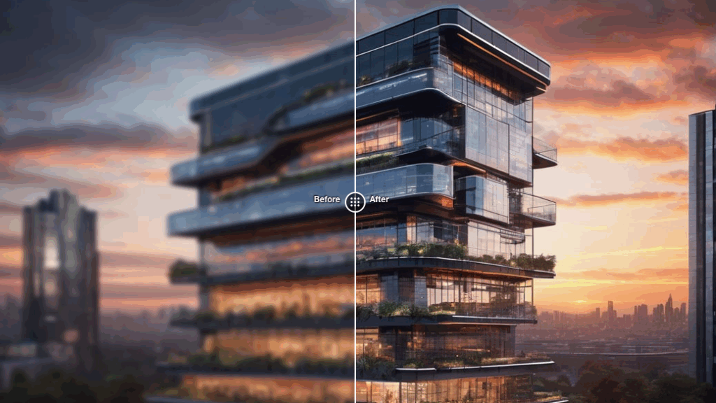
- Final retouch, noise, and sharpening after the upscale.
Why after color? Because any heavy grading can affect edges and texture, and we want those set before the AI starts guessing detail. Research on deep learning-based image upscaling shows how AI algorithms interpret edge information during the enhancement process.
2. For product / marketing shots
If the source is from a camera:
- Raw processing first (exposure, white balance, lens correction).
- Skin/retouch work.
- Export a high-quality PNG or high-quality JPG.
- Run PromeAI 2x for general use, 4x for print.
- Drop into InDesign, Figma, or Keynote for layout.
3. For social → print upgrades
This is where PromeAI feels almost like cheating.
Our flow:
- Take the original social asset (prefer source, not the Instagram download).
- Run a 2x upscale first. Check artifacts.
- If it holds up and we need even bigger, try 4x and compare.
- Add text, logos, and key UI elements after upscaling so they stay sharp and clean.
4. For UI and decks
For UI designers and marketers:
- We upscale background imagery and photography with PromeAI.
- We keep UI, logos, and icons as vectors or hi-res exports from Figma/Sketch.
- We combine them in the layout tool, so type and UI stay razor sharp.
If you want a quick starter “recipe,” here’s a simple one we actually use:
- Source: 1500px product shot, clean background
- Target: A3 print at 300 DPI for a client meeting
- Step 1: Color + contrast in Photoshop
- Step 2: Export PNG
- Step 3: PromeAI Upscaler → 4x upscale
- Step 4: Zoom to 100–150%, check edges, fabric, logo
- Step 5: Minor local blur on any crispy areas, then send to print
We’ve run variations of this across real client projects for months now, and it’s easily saved us from late-night rerenders more than once.
We know the frustration of staring at zoomed-in textures, hoping the AI didn’t “hallucinate” a new pattern onto your client’s furniture. Try PromeAI HD Upscaler with your own source files to see how we maintain the balance between sharpness and original intent.
Where do you usually get stuck with upscaling, print sizes, artifact control, or fitting it into your pipeline? If you tell us your workflow (architectural, product, or marketing), we can share a more specific setup to test next time you’re under a deadline.
PromeAI Upscaler: Frequently Asked Questions
When should I use 2x vs 4x with the PromeAI upscaler?
Use 2x when your source image is already decent quality and you’re going from web to small print, slide decks, or want a natural, less “processed” look. Use 4x when the file is smaller but clean and you need large prints, tighter crops, or hero images.
How do I decide where the PromeAI upscaler fits in my professional workflow?
Treat PromeAI upscaler as a late-stage helper. Do your color grading, contrast, and basic retouching first, then upscale (2x or 4x), and only after that apply final sharpening, noise, or local fixes. This keeps AI detail recovery aligned with your final look and layout needs.
What artifacts should I watch for after using the PromeAI image upscaler?
Zoom to 100–200% and check faces for waxy or crispy skin, jagged or haloed edges around text and products, repeated or fake-looking textures in fabric, distorted logos or UI, and noise turning into unrealistic “detail.” If those pass, you’re usually safe for client delivery and print.
Can the PromeAI upscaler prepare images for large-format printing, and what DPI should I aim for?
Yes. For close-view prints like magazines, aim for 300 DPI; for posters, around 200–240 DPI; for big banners and trade show graphics, 100–150 DPI is usually fine. A 4x upscale from a 1500px source (≈6000px) can comfortably cover premium posters and many large display formats.
Is the PromeAI upscaler good for heavily compressed or very noisy images?
It works best with clean, reasonably sharp sources. Heavily compressed or noisy images can cause the AI to “invent” textures or exaggerate artifacts. If possible, re-export a higher-quality PNG or minimally compressed JPG from the original design or RAW file, then run PromeAI upscaling on that instead.
Recommended Reads
Leave a Reply