We’ve all had that distinct sinking feeling: You upload a perfectly clean sketch, hit generate, and the result looks like it was viewed through a steamed-up bathroom mirror. Instead of a crisp architectural visualization, PromeAI gives you muddy textures and waxy, plastic-looking surfaces. It’s not just annoying; it’s a workflow killer when you have a client presentation in an hour.
Millie here, and I’ve spent the last week intentionally breaking renders to figure out why this happens. If you are tired of guessing which slider will fix blurry AI render outputs, this guide is your new troubleshooting bible. Let’s stop the guessing game and get your details back.

Problem Diagnosis Checklist
We’ll fix things faster if we name the problem correctly. Most “bad” AI renders in PromeAI fall into three buckets.
Muddy/blurry symptoms
If you’re seeing any of these, you’re in fix blurry ai render territory:
- Edges look soft even on high-contrast boundaries (chair silhouette, window mullions, product seams).
- Texture turns into “mush” (wood grain becomes a watercolor smear).
- Small elements vanish (fasteners, stitching, grout lines, perforations).
- Typography/logos get foggy or mutated.
Common causes we’ve observed:
- Strength too high (the model “repaints” everything and loses your structure).
- Source image too small or already compressed.
- Prompt is too vibe-y and not specific enough about surfaces.
Overcooked/plastic symptoms
This is the classic fix overprocessed ai situation:
- Skin/materials look waxy, shiny, or airbrushed.
- Everything has the same “AI gloss,” even concrete and fabric.
- Micro-contrast is aggressive (tiny dark halos around edges).
- Background bokeh looks fake, like a sticker blur.
Common causes:
- Realism/beauty bias in the model settings.
- Too many “cinematic / ultra / 8k / HDR” style words stacking.
- Strength/detail push that’s fighting your original lighting.
Color issues
This is where over-saturated fix tactics matter:
- Whites drift blue/green: neutrals go warm for no reason.
- Brand colors shift (especially reds and teals).
- Shadows are neon-ish instead of natural.
Common causes:
- Prompt pushes “vibrant” or “hyperreal” without guardrails.
- Auto color decisions from the model aren’t aligned with your reference.
Before we touch settings, we do one quick sanity check: is our input image clean?
- If it’s under 1200px on the long side, we usually upscale or re-export.
- If it’s a screenshot, we re-export from source (screenshots add compression + weird sharpening).
For more context on common problems in AI-generated images, this comprehensive guide covers similar issues across different AI image generation tools.
Settings Fixes
Settings are the fastest lever in PromeAI because they change behavior even when the prompt stays the same.
Below are the fixes we keep coming back to. We’ll call out parameters in bold so you can scan.
Strength adjustments
Think of Strength like how hard the AI is allowed to “re-interpret” your image.
- If your render is muddy/blurry, we usually lower Strength.
- If your render is off-theme and ignoring the concept, we raise Strength, but only after tightening the prompt.
What we do in practice:
- Start with Strength: 0.35–0.55 for product shots and architectural elevations.
- If you’re getting mush, step down in small moves (0.05 at a time).
- If you’re getting “same layout but nicer,” you’re in the sweet spot.
Quick rule we use:
- Blurry edges + lost geometry = Strength too high
- Wrong style + won’t change = Strength too low
Detail recovery
If you’re seeing muddy details, don’t immediately crank “detail” to the max. That often creates crunchy noise and that overcooked look.
Instead, we do this sequence:
- Lower Strength slightly (yes, first).
- Increase detail moderately.
- Add micro-detail words in the prompt (next section).
Also: if PromeAI offers a quality or resolution option in the workflow you’re using, we pick the highest we can afford time-wise for final outputs. For client work, we’ll do “fast drafts” first, then rerun the finalist at higher quality.
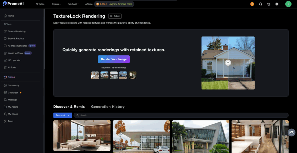
If you want to explore advanced rendering techniques, check out PromeAI’s TextureLock rendering feature for maintaining material consistency across renders.
If you want to go deeper on how image models behave with image-conditioning (why too much transformation smears structure), OpenAI’s image guidance is worth skimming: OpenAI Image generation docs. (Different tool, same basic physics.)
Prompt Fixes
Prompting is like seasoning.
If you dump ten spices in at once, you can’t tell what ruined the soup.
We keep PromeAI prompts short-ish, then add “micro” words that directly target the failure.
Micro-detail keywords
Use these when you need to fix blurry AI render output and recover muddy details.
We’ll usually add 3–6 of these (not all):
- “crisp edges”
- “sharp focus”
- “high micro-contrast” (careful, use lightly or it can get crunchy)
- “fine surface texture”
- “visible grain” / “visible pores” / “visible stitching”
- “clean linework”
- “defined seams”
- “material separation” (helps stop everything from blending together)
For architecture:
- “straight verticals”
- “clean mullions”
- “defined shadow gaps”
For product:
- “tight tolerances”
- “machined edges”
- “anodized aluminum texture” / “powder-coated finish”
If it’s getting too crunchy:
- Add “natural texture” and remove “HDR/ultra” language.
Realism anchors
This is where realism settings meet prompting.
When PromeAI goes plastic, we anchor it back to camera + lighting reality. We’ll add 2–4 of these:
- “shot on 50mm lens” (or 35mm for interiors)
- “softbox lighting” / “north-facing window light”
- “physically plausible materials”
- “no beauty retouching”
- “no plastic sheen”
- “subtle specular highlights”
- “natural skin texture” (if people are present)
Our favorite anti-overprocessed line (seriously it helps):
- “natural photo, minimal post-processing”
Mini prompt templates we actually use:
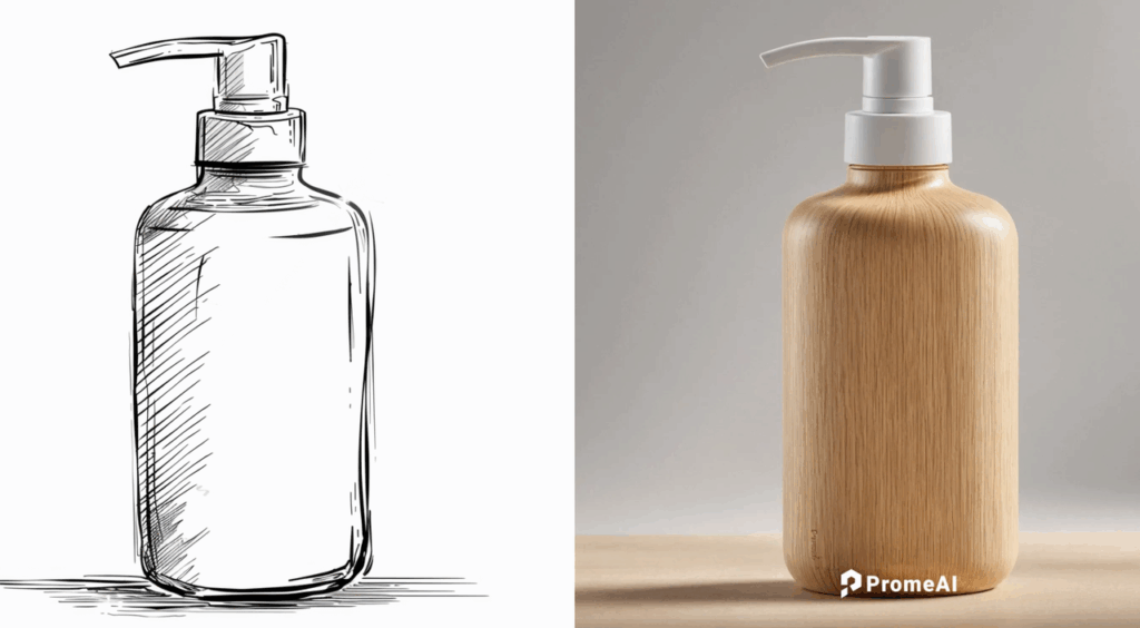
Product render repair:
- Prompt: “minimalist studio product photo, crisp edges, defined seams, anodized aluminum texture, subtle specular highlights, shot on 50mm lens, natural photo, minimal post-processing”
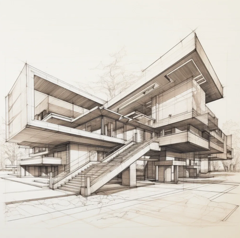
Architecture exterior repair:
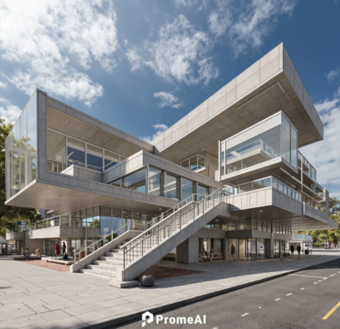
- Prompt: “architectural photograph, straight verticals, clean mullions, defined shadow gaps, realistic concrete texture, natural daylight, shot on 35mm lens, accurate neutral color”
Color guardrail add-on (for over-saturated fix):
- “neutral white balance”
- “accurate brand colors”
- “restrained saturation”
One more honest note: if your base image has stylized lighting (neon gradients, heavy LUT look), PromeAI will often amplify it. In that case, we’ll normalize the image first (see post-processing section).
For step-by-step guidance on mastering these techniques, visit PromeAI’s official tutorial academy for in-depth training resources.
Post-Processing Tweaks
We try to solve 80% inside PromeAI. But sometimes a 60-second external tweak prevents an hour of reruns.
When to adjust outside PromeAI
We step outside PromeAI when:
- The render is good, but color is drifting (brand work, packaging, UI on devices).
- The output is sharp, but has that overprocessed contrast curve.
- We need consistent results across a set (10 angles, 3 colorways).
Our quick fixes (Photoshop / Lightroom / even Affinity Photo):
- Fix over-saturation: pull Saturation down slightly, then use Vibrance to keep skin/materials alive without neon shadows.
- Fix the “AI crunch”: reduce clarity/texture a bit. If highlights look metallic, pull highlights down and add a gentle tone curve.
- Restore neutrality: set white balance using a known neutral (white wall, gray card area, or product label background).
- Selective sharpening (careful): sharpen edges/midtones, not noise. Masking is your friend.
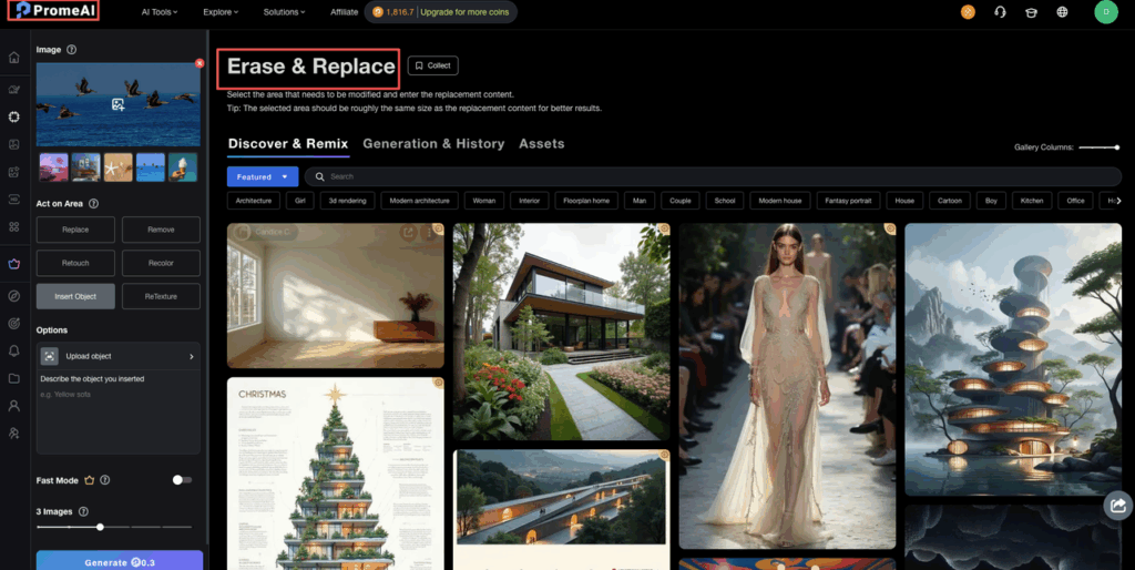
For precise edits on specific areas of your render, PromeAI’s inpainting tool lets you selectively refine problem zones without regenerating the entire image.
Privacy / workflow note (worth stating): PromeAI is a cloud tool, so we avoid uploading anything under strict NDA unless the client explicitly approves. For sensitive work, we’ll use anonymized geometry (no logos, no unreleased UI) and swap in the real assets later.
Before/After Examples
We can’t attach our client images here, but we can share the exact “before → after” patterns we saw across repeated tests. These are the ones we’d bet on in a pinch.
Example 1: Fix blurry AI render (product shot)
Before: headphone concept render looked smooth, but the earcup seam disappeared and the fabric texture turned to mush.
Change:
- Strength: 0.60 → 0.45
- Prompt add: “crisp edges, defined seams, fine surface texture, natural photo, minimal post-processing”
After: edges came back, seam read clearly, fabric texture stopped melting.
Example 2: Fix overprocessed AI (interior)
Before: kitchen render had shiny countertops, waxy wood cabinets, and aggressive contrast.
Change:
- Strength: 0.50 → 0.40
- Prompt remove: “HDR, ultra-detailed, cinematic”
- Prompt add: “north-facing window light, physically plausible materials, subtle specular highlights, no beauty retouching”
After: materials looked calmer and more believable: highlights stopped screaming.
Example 3: Over-saturated fix (branding mock)
Before: beverage can mock shifted the brand red into orange and made shadows teal.
Change:
- Prompt add: “accurate brand colors, neutral white balance, restrained saturation”
- Outside PromeAI: tiny WB correction + saturation down ~5–10 (depends on your file)
After: brand color landed closer to spec and stayed consistent across reruns.
If we had to boil this whole PromeAI guide down to one habit: change one thing at a time.
- If it’s blurry, lower Strength first.
- If it’s plastic, anchor realism with camera/light language and remove “HDR/ultra.”
- If it’s neon, add color guardrails and finish with a small external color correction.
We’ll end with a real question, because this is where we see designers get stuck:
What’s your most annoying failure mode right now in PromeAI: blurry/muddy details, overcooked materials, or colors that won’t behave? If you tell us what you’re rendering (product, interior, exterior, ad mock), we’ll suggest a tight prompt + settings combo to try next.
We’ve shared the exact settings and realism anchors to stop the guessing game. Now it’s time to apply these fixes to your own architectural or product workflows. Open PromeAI and test these adjustments on your next draft.
Frequently Asked Questions (FAQ)
How do I fix blurry AI render output in PromeAI without losing my original layout?
To fix blurry AI render output in PromeAI, lower Strength first—high Strength often repaints structure and smears edges. Start around 0.35–0.55, then step down in 0.05 increments. Add micro-detail cues like “crisp edges,” “defined seams,” and “fine surface texture” instead of maxing Detail.
Why does my PromeAI render look plastic or overprocessed, and how can I fix it?
Plastic, overcooked renders usually come from realism/beauty bias plus stacked style words like “HDR,” “ultra,” or “cinematic,” and too much Strength/Detail. Reduce Strength slightly, remove the heavy stylized terms, and add realism anchors such as “physically plausible materials,” “subtle specular highlights,” and “natural photo, minimal post-processing.”
What are the best PromeAI settings to fix muddy details and “mushy” textures?
For muddy details, don’t immediately crank Detail to the maximum—it can create crunchy noise. Use a sequence: lower Strength slightly, raise Detail moderately, then add 3–6 targeted micro-texture phrases (e.g., “visible grain,” “clean linework,” “material separation”). Also use the highest quality/resolution option for final renders when possible.
How can I stop PromeAI from changing brand colors or making renders over-saturated?
Add explicit color guardrails in your prompt: “accurate brand colors,” “neutral white balance,” and “restrained saturation.” If color still drifts, do a quick external correction: reduce Saturation a bit (often 5–10), use Vibrance to keep materials alive, and set white balance from a known neutral area like a label background or gray surface.
What input image quality do I need to avoid AI render problems in PromeAI?
A clean, sufficiently large input image prevents many PromeAI failures. If your source is under ~1200px on the long side, upscale or re-export before rendering. Avoid screenshots when possible—compression and odd sharpening can cause soft edges, smeared textures, and foggy typography that the model then amplifies.
Recommended Reads
Leave a Reply