Traditional resizing is destructive; you are almost always cutting something away to fit a vertical Story or a horizontal banner. PromeAI Outpainting ad banner templates flip that script by adding context instead of removing it, giving your design room to breathe. However, giving an AI permission to “fill in the blanks” is risky if you don’t set boundaries.
I am Millie. I’m sharing my personal cheat sheet for accurate edge extension—specifically for Instagram, YouTube, and Facebook ratios. We’ll cover why simple prompts win, how to handle edge detection failures, and the specific settings that keep your ads looking professional rather than “AI-generated.”
When Outpainting Fails (and Why)
Before we talk PromeAI templates, we have to be honest: AI outpainting can make a mess if we let it.
We spent a couple of days stress‑testing outpainting frameworks (including the one behind PromeAI, similar to the approaches in this outpainting paper) and we kept running into two very repeatable issues.
Edge detection issues
Outpainting lives or dies on how clean the edge of your original image is.
Here’s what tends to break:
- Hard, high‑contrast edges (like a product cutout) bleeding into a soft, noisy AI background.
- Architectural lines that should be straight but bend or misalign as the AI expands the canvas.
- People or objects sliced right at the crop, so the AI “finishes” them with extra limbs or weird geometry.
With PromeAI’s outpainting tool (they walk through the basics here), we’ve had the best luck when:
- We avoid cropping through key objects. We keep the hero product or person fully inside the original frame.
- We let the AI extend pure background first (sky, wall, desk, gradient) and keep structure simple.
- We use a feathered mask near the edge if we’re editing in multiple passes.
Think of it like extending wallpaper. If the pattern is simple and uninterrupted at the edge, the repeat looks clean. If you cut through a lamp, no wallpaper can save you.
Content mismatch
The second big fail: the outpainted area looks like it belongs to a different campaign.
We see this a lot with:
- Lifestyle shots where the AI adds random furniture, people, or props that were never in the original.
- Color shifts where the brand palette drifts into off‑tones.
- Extra logos or fake text (“AI lorem ipsum”) that clutter the ad.
The fix has two parts:
- Prompt discipline. Instead of a long poetic prompt, we stick to a short, factual one:
- Prompt: extend the existing soft beige background, subtle gradient, no new objects, no text
- Style: match current photo style, same lighting
- Content bans. We explicitly say what we don’t want:
- no extra hands, no extra products, no furniture, no text, no logo
PromeAI’s own tutorial examples (see their academy section) lean heavily on this idea: describe the continuation, not an entirely new scene. That mindset alone cuts failures in half for us.
Size Templates
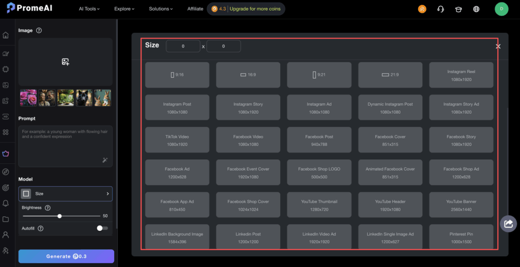
Now into the fun part: using PromeAI outpainting to jump between common ad creative sizes without rebuilding everything.
We usually start with a strong 1:1 key visual, then expand or crop outwards for other formats using the outpainting tool plus their ad banner templates.
For reference, we cross‑check sizes against the latest Sprout Social image size guide and platform docs like Meta’s business help center.
1:1 Instagram post
Our base canvas is almost always 1080 × 1080 (1:1).
We treat this as the “hero” version:
- Product or main subject centered.
- Key headline dead center or slightly above.
- Clean background with space on all sides to give the AI room to grow later.
Cheat sheet:
- Model/Tool: PromeAI Outpainting
- Base size: 1080 × 1080
- Prompt: extend the existing background texture, keep same lighting, no new objects, no text
- Use case: This is the safe playground before we go wide or tall.
16:9 YouTube thumbnail
YouTube wants 16:9, usually 1280 × 720 or 1920 × 1080.
The common pain point: our 1:1 Instagram image suddenly needs huge horizontal padding for a title, logo, and maybe a face close‑up.
Our flow:
- Open the 1:1 in PromeAI and set the output to a 16:9 ratio.
- Use outpainting to grow left and right, not top and bottom.
- Prompt for background only:
- Prompt: extend the current background to the left and right, same color and texture, no extra people, no text
Then we manually place:
- Big headline text on the left or right.
- Face or product close‑up near center.
This keeps the visual consistent while giving YouTube its wide, click‑able look.
9:16 Stories/Reels
Stories, Reels, and Shorts want 9:16 vertical. This is where aspect ratio AI saves us a lot of pain.
We usually:
- Start from the 1:1.
- Extend top and bottom with PromeAI outpainting.
- Keep the key content in the vertical center “safe zone”.
Settings we like:
- Output ratio: 9:16
- Prompt: extend the existing background upwards and downwards, keep it simple and uncluttered, no new objects
- Tip: We mention leave space at the top and bottom for text overlays so the AI doesn’t cram details there.
Once done, we drop it into our Stories layout and add:
- CTA bar at the bottom.
- Logo and small text at the top.
The extended background basically becomes clean breathing room for motion and text.
4:5 Facebook feed
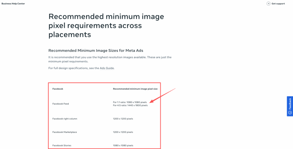
Meta loves 4:5 ratios for better feed real estate.
From our 1:1, it’s a small jump, but we still use outpainting for a smoother, less “cropped” look:
- Set output to 4:5 vertical.
- Outpaint slightly at the top and bottom.
- Prompt to keep it subtle:
- Prompt: extend the current background a little at the top and bottom, same style, no new elements, no patterns
This gives enough extra room to adjust layout while keeping the creative visually tied to the square post.
Prompt Patterns for Seamless Expansion
Prompting for outpainting feels a bit like seasoning food.
Too much spice and the AI invents a new dish. Too little and you get bland, flat backgrounds.
Here are the patterns we keep coming back to:
1. Describe the edge, not the whole scene
We focus on what’s already at the border:
- continue the soft beige wall
- extend the marble countertop texture
- more of the blurred city background
That reminds the model to copy the vibe, not start over.
2. Be strict about “no new objects”
We almost always add lines like:
- no people, no hands, no furniture, no extra products, no text
This keeps the AI from dropping random stuff into what should be clean banner space.
3. Use brand color language
Instead of saying “nice colors,” we reference the brand palette:
- warm beige and soft charcoal tones
- stay within muted pastel blues and pinks
We sometimes keep a simple brand style doc open and echo wording from there.
4. Keep prompts short
From our tests (and confirmed by other tutorials like this Stable Diffusion outpainting guide), shorter prompts with clear limits win.
One pattern we reuse a lot for ad creative sizes:
- Prompt: extend current background, same lighting and texture, no new objects, no text, keep composition simple
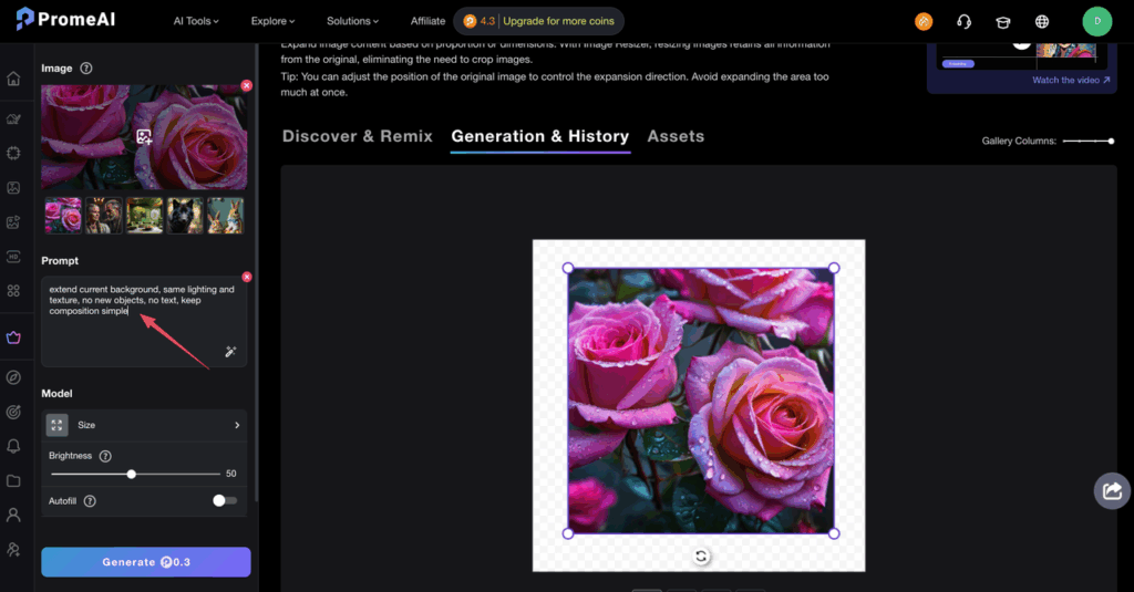
We pair that with a lower creativity / variation slider so the AI behaves more like a clone stamp than a concept artist.
Brand-Safe Margins Guide
Here’s where a lot of outpainted banners go wrong: the AI fills every corner, and we suddenly have nowhere clean to place copy or logos.
To keep outpainting useful for real ad work, we treat margins like a sacred zone.
Our go‑to safe zones (rough rule of thumb):
- Stories / Reels (9:16): keep crucial text and logos within the central 80% height and central 80% width.
- Feed posts (1:1, 4:5): keep text/logos away from the outer 10% on all sides.
- YouTube thumbnails (16:9): keep faces and main text in the central 70% horizontally.
We let PromeAI outpaint into the unsafe edges on purpose:
- The AI fills the outer 10–15% with simple, brand‑aligned background.
- We then design inside the safe zone so platform UI, crops, and scroll bars don’t eat the important stuff.
To help the AI keep those edges simple, we often add:
- Prompt: extend background only in the outer edges, keep them clean and lightly textured, avoid busy detail, no text
And if a generation comes back too noisy, we just run another pass, masking only the messy corner.
From a trust angle, we also keep an eye on:
- Brand safety: no weird objects or implied content that could be misread at small sizes.
- Copyright: we start from assets we have full rights to, then use AI outpainting as a layout helper, not a stock replacement.
If you want to dig deeper into platform rules, the official docs from Meta and recent posts on ad image sizing from places like Sprout Social are worth bookmarking. For broader context on how advertisers can harness AI while navigating brand safety, consumer trust, and legal concerns, industry resources can help guide your strategy.
We’ve found PromeAI’s outpainting and ad banner templates genuinely useful for fast, consistent banner resize work, as long as we:
- Start from a clean, well‑composed 1:1.
- Let AI handle background extension, not core content.
- Guard our brand margins like they’re sacred.
We’ve shown you the prompt patterns, safe zones, and platform ratios. Now grab a 1:1 asset you already love and run it through PromeAI‘s outpainting tool—extend the background for Stories, YouTube, or feed, and see if it saves you a rebuild.
Where do you usually get stuck in this process, weird edges, size chaos, or brand safety? That’s the part we’d love to stress‑test next.
Frequently Asked Questions
What are PromeAI outpainting ad banner templates and how do they help with ad resizes?
PromeAI outpainting ad banner templates are preset aspect ratios you use with the outpainting tool to extend backgrounds and adapt a single key visual into multiple ad sizes. Instead of rebuilding each layout, you expand clean background areas, then place headlines, logos, and CTAs within platform-safe zones.
How should I set up a base image for PromeAI outpainting ad banner templates?
Start with a clean 1:1 visual, usually 1080 × 1080. Keep the hero product or person fully inside the frame, center key headlines, and leave background space on all sides. This gives PromeAI enough simple texture to extend for 16:9, 9:16, and 4:5 formats without artifacts.
What prompt patterns work best for clean, brand-safe outpainting?
Describe only what’s at the edge, not a new scene: “extend soft beige wall,” “continue marble texture.” Keep prompts short and restrictive: “same lighting and texture, no new objects, no text.” Add content bans like “no extra hands, no furniture” to prevent random elements that break branding.
How do I keep text and logos within brand-safe margins across formats?
Treat edges as buffer zones. For 9:16 Stories/Reels, keep crucial text and logos within the central 80% both ways. For 1:1 and 4:5 feeds, avoid the outer 10% on all sides. For 16:9 thumbnails, keep faces and main text in the central 70% horizontally, letting AI fill outer areas.
What’s the best way to adapt one key visual into Instagram, Facebook, and YouTube ads with PromeAI?
Start from a strong 1:1 hero image. Use PromeAI outpainting ad banner templates to extend horizontally for 16:9 YouTube thumbnails and vertically for 9:16 Stories/Reels or 4:5 Facebook feed. Only outpaint background, then manually add platform-specific text, CTAs, and logos inside recommended safe zones.
Recommended Reads
Leave a Reply