Have you ever watched your high-res product shot turn into a Salvador Dalí painting after hitting ‘generate’? If you’ve dealt with “alphabet soup” labels and faces that breathe like a horror movie extra, you’re not alone. I’m Dora, and I’ve spent more hours than I’d like to admit watching Vidu Q3 Image-to-Video turn my crisp renders into shimmering chaos. But here’s the thing: Vidu isn’t random; it’s just sensitive. After running dozens of generations, I’ve cracked the code on motion control and preventing warping. In this guide, I’m sharing the exact “film shoot” workflow that gets me three client-ready takes in under 15 minutes. No more melting logos or vibrating backgrounds—just controlled, premium motion that actually follows your lead.
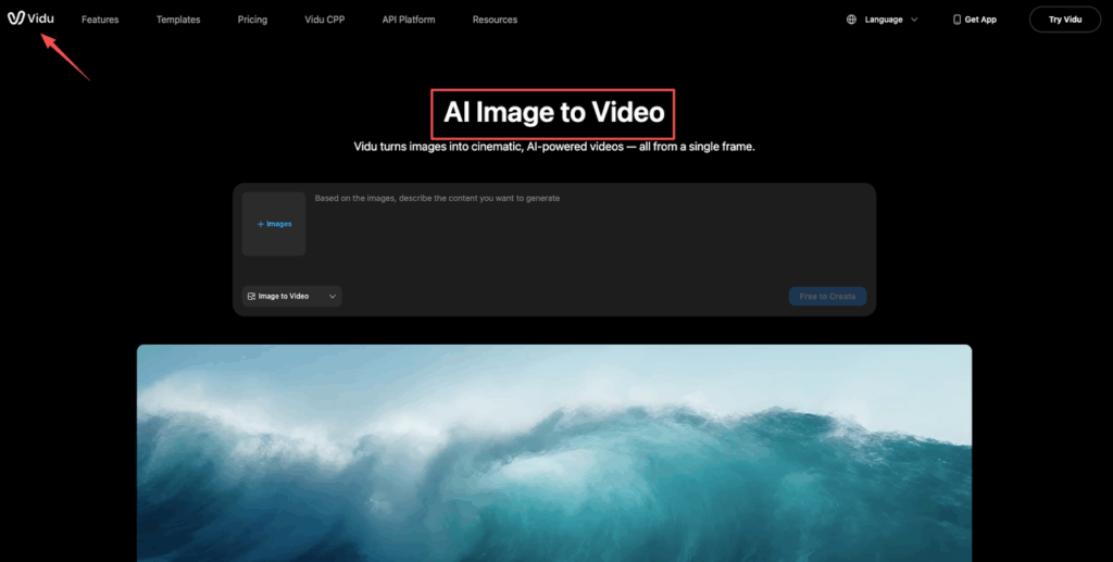
(Official reference if you want to cross-check features/limits: Vidu’s Image-to-Video page.)
Pick the right reference image (framing, lighting, resolution)
If Vidu Q3 image to video feels “random,” 80% of the time it’s the starting image. Image-to-video isn’t forgiving. It’s more like giving an editor a clean plate.
Here’s what’s worked best in our testing (we ran ~40 generations across product shots, interiors, and portrait-ish lifestyle frames):
- Framing: Keep your subject big enough to read.
- Product: subject should fill 40–70% of the frame.
- Architecture/interiors: avoid ultra-wide distortion: straight verticals help.
- Lighting: Soft, consistent lighting wins.
- Big contrast shifts (hard sun + deep shadows) often turn into shimmer/flicker when motion starts.
- Background: Simple backgrounds = fewer warping surprises.
- Busy patterns (blinds, chain-link, tiny leaves) love to crawl.
- Text: If your image has text (packaging, signage), assume it will degrade.
- Either remove text before generating, or keep it large and high-contrast.
Resolution-wise, we’ve had the cleanest motion from images that are:
- Crisp (no motion blur)
- Not overly sharpened (no crunchy halos)
- High enough res that facial features aren’t 12 pixels wide
Our quick pre-flight checklist (takes 30 seconds):
- Zoom in to 200%.
- If you already see jaggies on edges, tiny banding in gradients, or mushy eyes… video will amplify it.
Tiny trick from our day-to-day: if the reference image is “almost there,” we’ll do a fast edit first (Lightroom/Photoshop):
- Lift shadows slightly
- Reduce clarity/texture a touch (yes, really)
- Clean up specks/dust that might turn into moving artifacts
Think of it like this: your reference image is the cake. The motion prompt is just the frosting. If the cake is lumpy, frosting can’t save it.
Motion prompt patterns (what moves + how much + speed)
Most people prompt motion like: “Make it cinematic, dynamic movement, lots of motion.”
And then they’re shocked when everything melts.
We get better results by writing motion like a shot list:
- What moves (subject vs environment)
- How much (micro vs moderate)
- Speed (slow, steady)
Here are motion prompt patterns we reuse constantly:
- Micro-motion (safe, premium-feeling):
- “Subtle breathing motion, slight hair movement, gentle fabric flutter, minimal motion.”
- Product hero (great for marketers):
- “Soft light roll across surfaces, gentle highlight shift, minimal object movement.”
- Architecture/interior (avoid wobble):
- “Curtains move slightly, plants sway gently, sunlight shimmer very subtle.”
A copy-paste cheat sheet we’ve been using (edit the bracketed parts):
- Prompt: “Add subtle motion: [one thing] moves slightly, [second thing] moves gently. Slow, steady movement. Keep details crisp.”
And we keep one big rule: Pick 1–2 motion ideas max.
If you ask for hair + hands + eyes + camera orbit + background parallax + sparkle… you’ll get a horror show.
“Keep subject stable” constraints
This is the line that saves us the most rerolls.
When we want the subject to stay recognizable (faces, branded products, hero objects), we add explicit constraints like:
- “Keep the main subject stable and centered.”
- “No morphing, no shape changes.”
- “Preserve identity and proportions.”
- “Background motion only.”
For product shots specifically, we’ll say:
- “Keep label and logo shape stable: avoid warping.”
Does it fully prevent drift every time? No. But it reduces the odds of the subject slowly turning into a cousin of itself.
Also: if you want motion without object deformation, ask for lighting motion:
- “Subtle specular highlights moving across surface”
It’s like faking motion with a reflector on set. Looks expensive, doesn’t break anatomy.
Camera prompts for I2V (push-in, orbit, tracking)
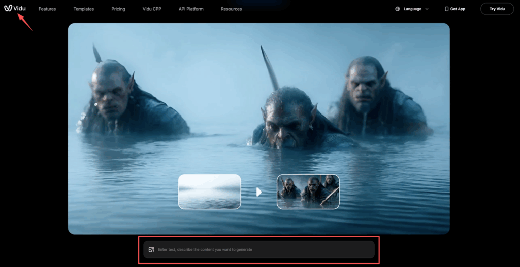
Camera prompts are where Vidu Q3 image to video can look insanely good… or instantly fall apart.
We treat camera movement like seasoning. A little = tasty. Too much = you can’t eat it.
Three camera moves we’ve had consistent success with:
- Push-in (our default):
- “Slow push-in, smooth, minimal parallax.”
- Great for: product hero shots, portraits, still interiors.
- Orbit (use carefully):
- “Very slight orbit left, slow, small angle.”
- Great for: objects with clear 3D shape.
- Risk: edges warp, background swims.
- Tracking (for subject emphasis):
- “Gentle right-to-left tracking, keep subject centered, steady speed.”
- Great for: wide scenes where you want a little life.
A camera prompt pattern we like because it’s specific:
- Prompt: “Slow push-in (5–10%), smooth motion, stable framing, no jitter, shallow parallax.”
If you’re working with architecture renders, we recommend push-in + tiny tilt over orbit. Orbit loves to bend straight lines.
And if your reference image includes text (packaging, signage), avoid fast camera movement. Motion blur + text = instant nonsense.
If you want “cinematic,” we’ve found it’s better to describe stability than vibes:
- “Smooth, steady, tripod-like, no handheld shake.”
(And if you’re curious about how these tools generally frame model capabilities and limits, Runway’s text-to-video prompting guide offers a solid, practical style for describing image/video system behavior that translates well across tools.)
Stability & artifact fixes (hands, faces, text, flicker)

Let’s talk about the four classic failures: hands, faces, text, and flicker.
We don’t try to “prompt our way out” of all of them. We mix prompting + choosing safer inputs + rerun strategy.
Here’s what actually helps.
- Hands
- Avoid: hands doing complex actions (gripping, pointing, interacting with small objects).
- Do instead: hands relaxed, partially out of frame, or not the focal point.
- Prompt add-on: “Hands remain still: no finger deformation.”
- Faces (identity drift, weird mouth/eyes)
- Avoid: extreme expressions, half-obscured faces, dramatic side lighting.
- Do instead: clean face, even lighting, medium shot.
- Prompt add-on: “Preserve facial identity: subtle expression: no facial warping.”
- Text (logos, labels, UI screens)
- Reality check: most I2V systems struggle to keep text perfectly stable during motion.
- Fix approach:
- Keep text large and simple.
- Minimize camera movement.
- If it’s a product label, consider generating without text, then overlay the real label in edit.
- Flicker / shimmer (the ‘why is everything vibrating?’ problem)
- Usually caused by: busy textures, harsh contrast, too much motion, or tiny details.
- Fix approach:
- Reduce motion intensity (“subtle,” “minimal”).
- Prefer push-in over orbit.
- Simplify the background.
- Slightly soften/sharpen-balance the input image before generation.
One more thing we have to say out loud: privacy & usage.
If your reference image includes client work, unreleased products, or faces, treat it like you would any cloud tool. Read the platform’s terms and data handling info first, and get client approval if needed. Start with Vidu’s official AI image-to-video policies and features from their site.
Our practical compromise for client work: we test with a stand-in image first (same framing/lighting), then swap in the real asset only when the prompt is behaving.
Best practices for re-runs (small edits, not rewrites)
Reruns are where most teams lose an afternoon.
The trick: don’t rewrite the whole prompt. Make one small change, then rerun. Otherwise you can’t tell what fixed (or broke) the output.
Our rerun loop looks like this:
- Lock the core intent in one sentence.
- Change one variable per rerun:
- motion amount (micro → moderate)
- camera move (push-in → tiny orbit)
- stability constraint (add “no morphing”)
- background complexity (swap reference image)
A simple rerun log we keep in a Notes doc:
- Take 1: “push-in, subtle fabric flutter” → good motion, slight edge shimmer
- Take 2: same + “background motion only” → shimmer reduced
- Take 3: same + softened input image slightly → best
If you want a super practical rule: keep 80% of the prompt identical and tweak 20%.
Also, we label our prompt blocks like this so anyone on the team can reuse them:
- Model: Vidu Q3 (I2V)
- Prompt (Motion): “Subtle breathing, gentle hair movement, minimal motion, slow.”
- Prompt (Camera): “Slow push-in 5–10%, smooth, no jitter.”
- Constraints: “Keep subject stable, preserve identity, no warping.”
If we had to pick one habit that improved output quality fast: we stopped chasing “cool” and started chasing “controlled.”
As covered in Vidu’s global AI video production showcase at Global Creativity Week, the platform is evolving rapidly — which means the workflows you lock in now will keep compounding in value as the model improves.
If you try this workflow, where do you usually get stuck — choosing the right reference image, getting stable faces, or dialing in a camera move that doesn’t wobble?
Great motion starts with a clean plate, which is why we’ve integrated HD upscaling and motion brushes into one workspace. We invite you to test your most challenging reference images on PromeAI today. See how our stable architecture handles the fine details that others might melt.
Frequently Asked Questions about Vidu Q3 Image to Video
What is Vidu Q3 image to video, and why do results sometimes feel “random”?
Vidu Q3 image to video animates a single still image into short video takes. When outputs feel random, it’s usually the starting image: low detail, harsh contrast, busy textures, or tiny facial features get amplified once motion begins. Treat the reference image like a clean “plate” for editing.
How do I choose the best reference image for Vidu Q3 image to video?
Use a crisp, well-lit image with simple backgrounds and readable framing. For products, aim for the subject to fill about 40–70% of the frame. Avoid ultra-wide interior distortion, harsh sun/shadow contrast, and busy patterns. If edges look jaggy at 200% zoom, video artifacts will worsen.
What motion prompts work best for Vidu Q3 image to video without melting the scene?
Write motion like a shot list: what moves, how much, and how fast. Keep it to 1–2 motion ideas (micro-motion wins). A reliable pattern is: “Add subtle motion: [one thing] moves slightly, [second thing] moves gently. Slow, steady movement. Keep details crisp.”
How can I keep faces, products, and logos stable in Vidu Q3 image to video?
Add explicit constraints that prioritize identity and shape: “Keep the main subject stable and centered. No morphing, no shape changes. Preserve identity and proportions.” For product shots, include “Keep label and logo shape stable: avoid warping.” When possible, fake motion with moving highlights instead of moving anatomy.
Which camera move is safest for Vidu Q3 image to video (push-in vs orbit vs tracking)?
A slow push-in is usually the safest and most “premium” looking: “Slow push-in (5–10%), smooth motion, stable framing, no jitter, shallow parallax.” Orbit can look great but often warps edges and bends straight lines (especially architecture). Tracking works well if you keep the subject centered and speed steady.
Recommended Reads
Leave a Reply