Okay, I need to tell you about something that happened last Tuesday.
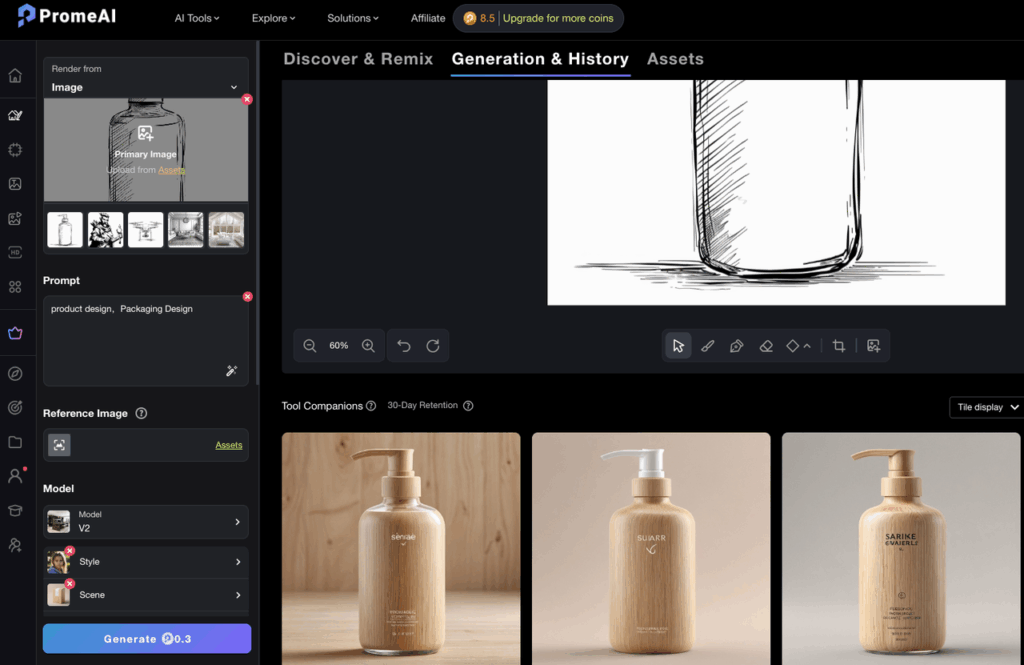
I had two versions of the same floor plan — one I’d sketched with a 0.5mm Staedtler on tracing paper, and one I’d drawn in Procreate with a clean vector-ish brush. Same room. Same layout. I fed both into PromeAI’s sketch rendering mode and walked away to make coffee.
When I came back? The results were so different I almost thought I’d used different prompts.
Same space. Same style prompt. Wildly different outputs.
That’s when I realized: the type of line input you use matters way more than people talk about. Not just the quality — the type. Hand-drawn and digital lines behave differently inside an AI renderer, and knowing which to reach for (and when) will save you a ton of trial and error.
Let’s get into it.
Hand-Drawn vs Digital Line Input: Key Differences
Before we get into prep tips, it helps to understand why these two inputs produce different results. It’s not just about resolution.
When you upload a hand-drawn sketch, the AI sees organic variation. Line weight shifts. Corners are slightly imperfect. There’s a natural taper where your pen pressure changed. PromeAI’s rendering engine actually reads these imperfections as creative signals — it fills in gaps, interprets blurry areas with some artistic license, and tends to produce results that feel more atmospheric and loose.
Digital line drawings are a different story. Whether you drew in Procreate, exported from Illustrator, or used a crisp architectural brush — the lines are uniform, high-contrast, and structurally precise. The AI treats these as more literal instructions. What you draw is closer to what you get.
Neither is better. They’re just different tools for different moments.
Line weight consistency
Hand-drawn: inconsistent by nature. This actually helps early-stage exploration because the renderer interprets loosely and generates more freely.
Digital: consistent and clean. Better for structural accuracy, especially if you need walls to stay walls and columns to stay columns.
Scan quality vs vector sharpness
Here’s the thing most people skip: a hand-drawn sketch that’s been poorly scanned performs worse than one that’s been well-scanned. Muddy midtones, yellowish paper background, low contrast — all of that confuses the model. A sharp, high-contrast scan of a mediocre sketch will almost always outperform a blurry scan of a great sketch.
Digital lines don’t have this problem. They’re already pixel-perfect from the moment you export.
Preparing Hand-Drawn Line Sketches
This is the part that takes 5 minutes but makes a 40% difference in output quality. I’ve tested this obsessively.
Scanning resolution tips
- Minimum: 300 DPI. This is non-negotiable. Anything lower and fine line detail gets lost.
- Preferred: 600 DPI. If your scanner supports it, use it. Especially for dense hatching or small-scale drawings.
- File format: PNG or TIFF. Not JPEG. Compression artifacts on line drawings are brutal — they introduce weird pixel noise right where the AI is trying to read your lines.
- Scanner mode: Black & White or Grayscale (not Color). Color scans of pencil drawings introduce unnecessary tonal variation that doesn’t help.
If you’re using a phone scanner, Apple’s iOS Document Scanner works well — just make sure you’re in bright, even light with zero shadows on the paper. Shooting overhead with a ring light is genuinely worth it.
Contrast adjustment
After scanning, do this before uploading:
- Open in Photoshop, Lightroom, or even Preview on Mac.
- Bump Contrast up by 30–50 points.
- Bump Brightness up slightly to make the paper background closer to pure white.
- Optional: Use a Threshold adjustment layer in Photoshop (Image > Adjustments > Threshold) set around 100–130 to get sharp black-on-white lines. This is especially useful for pencil sketches.
The goal: black lines, white paper, no grey zones. The cleaner this is, the more precisely PromeAI can “read” your drawing.
Preparing Digital Line Drawings
This is more about what not to do than what to do. I’ve seen so many people upload Procreate files with colored backgrounds, multiple active layers, or linework on a transparent canvas. All of these create problems.
From Procreate or Illustrator
In Procreate:
- Flatten your line layer(s) onto a white background.
- Turn off any color or texture layers. Linework only.
- Export as PNG (not JPEG).
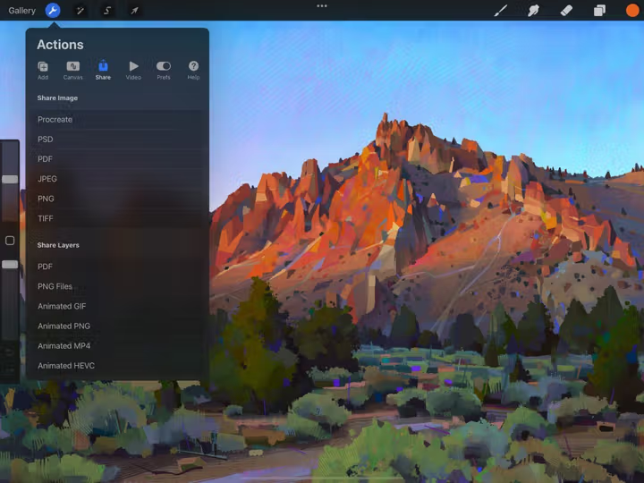
- Don’t export at “Screen” size — go to Actions > Share > PNG and keep it at full canvas resolution.
In Illustrator:
- Make sure your artboard background is white, not transparent.
- Expand all strokes before export (Object > Expand Appearance).
- Export as PNG at 150 PPI or higher. Vector PDFs can work but PNG is more reliable for consistent results.
One thing I learned the hard way: don’t use hairline strokes. Anything under 0.5pt tends to disappear or become inconsistent after rasterization. Use at least 1pt stroke weight for primary lines, 0.5pt for secondary detail lines.
Export settings
Ideal settings for PromeAI input:
- Format: PNG
- Color mode: Grayscale (or RGB with black lines on white background)
- Resolution: 1024×1024px minimum; 2048×2048px for complex drawings
- Background: Solid white, not transparent
One more thing — avoid anti-aliasing on linework if you can control it. Soft, anti-aliased edges make lines look clean to the human eye but introduce grey pixel fringing that the renderer doesn’t know what to do with. Hard-edged, crisp black lines consistently outperform.
Side-by-Side Render Comparison
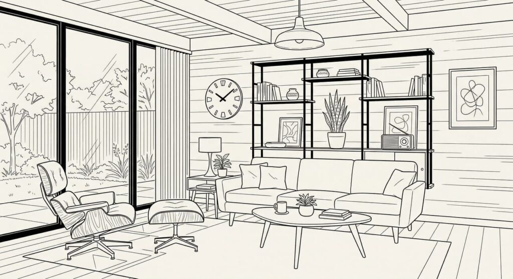

Here’s what I found when I ran the same room (a mid-century living room with an open shelving unit and a low sofa) through both input types, using identical prompts and settings:
Prompt used:warm afternoon light, Scandinavian minimalist interior, linen textures, oak wood tones, natural shadows, photorealistic
Strength setting: 0.7 (to preserve line structure) Style: Interior Design Aspect ratio: 4:3
Same design, two input types
| Hand-Drawn Scan | Digital Line (Procreate) | |
| Structure accuracy | Loose — sofa shape softened, shelf depth estimated | High — proportions preserved almost exactly |
| Atmosphere | Warmer, more “lived-in” feel | Crisper, more architectural |
| Light interpretation | AI added interesting shadow play in unspecified areas | Shadows tracked the actual geometry more faithfully |
| Texture rendering | Rich, more interpretive | Precise but can feel slightly flatter |
| Time to good result | 2–3 iterations | 1–2 iterations |
The hand-drawn render felt like something you’d find on an architecture mood board. The digital render felt like an early-stage visualization you’d actually show a client.
Both are useful. Just for different moments.
When to Use Each
This is really the question, right? And the answer is less about quality and more about where you are in the project.
Early concept: hand-drawn wins for speed
When you’re still figuring out the direction, hand-drawn sketches are faster to produce and more forgiving to render. You can scribble three spatial ideas in 10 minutes and render all three to see which direction has legs.
The AI’s “interpretive” nature with hand-drawn input actually works for you here. You don’t need precision — you need atmosphere. You want to see if the space feels right before you commit to anything.
Also: clients often respond better to hand-drawn-sourced renders at early stages. They know it’s exploratory. The roughness signals “this is a conversation” rather than “this is decided.”
Presentation quality: digital lines give more control
Once you know the direction and you’re moving toward client presentation or competition submission, digital lines are worth the extra setup time.
You get:
- Proportions that hold
- Structural elements that don’t “drift” between iterations
- More predictable results across multiple renders of the same space
- Better output at higher strength settings (0.8–0.9) without losing the design intent
If you’re building a slide deck or sending a PDF to a client, render from clean digital linework.
Troubleshooting Line Input Issues
A few things I’ve hit repeatedly and figured out:
Problem: The renderer is ignoring my lines and generating something totally different. Usually a contrast issue. Your lines aren’t dark enough relative to the background. Go back and boost contrast before re-uploading.
Problem: Walls are showing up as windows (or vice versa). This happens with very thin lines or when line gaps are too large. Thicken your primary structural lines and make sure closed shapes are actually closed — even a 1px gap can confuse the AI.
Problem: The render looks great but the proportions are way off. You might have your Strength setting too low. Try pushing it up to 0.75–0.85. A lower strength means the AI is generating more freely and paying less attention to your input as a structural guide.
Problem: My hand-drawn sketch has pencil smudging and the render looks muddy. Clean it up before uploading. Use the Threshold trick I mentioned earlier. The smudge reads as texture to the model and it’ll try to reproduce it in the render.
Problem: My Procreate export has a transparent background and weird grey artifacts. Flatten onto a white layer before exporting. Transparent backgrounds create issues — always render onto white.
The Bottom Line
Hand-drawn or digital — there’s no wrong answer. There’s just the right tool for where you are in the project.
Rough idea stage? Grab your sketchbook. The AI will work with your looseness.
Moving toward presentation? Clean up your digital lines. You’ll get tighter, more reliable results.
And whatever input type you use: high contrast, clean background, and proper resolution are the three things that will make or break your render quality before you even touch a prompt.
I genuinely spent a full week running comparison tests on this (yes, on a weekday, yes I regret nothing), and the contrast prep step alone made a bigger difference than switching between hand-drawn and digital in most cases.
Where do you usually get stuck with line inputs? I’ve heard everything from “my scans always look grey” to “Procreate exports keep coming out weird” — drop your specific issue below, I’m curious what problems people are actually running into.
Frequently Asked Questions
Does PromeAI render vector line drawings differently from raster scans? PromeAI processes images in raster format, so a vector drawing (from Illustrator, for example) needs to be exported as a PNG before uploading. The key difference isn’t vector vs raster — it’s edge sharpness and contrast. A clean 300 DPI raster scan with high contrast can actually outperform a poorly-exported vector file.
Do thinner lines or thicker lines produce better renders? Thicker primary lines tend to give the AI clearer structural information. For main walls, outlines, and major forms, use at least 1pt stroke (digital) or a felt-tip or fineliner pen (hand-drawn). Thin detail lines work fine as secondary information — just make sure the hierarchy is clear.
Can I mix digital and hand-drawn elements in one input? Yes, but it takes some prep work. The most common approach is to scan your hand-drawn sketch and then trace over specific elements digitally (walls, key structural lines) to sharpen them. Flatten everything onto a white background before uploading. This hybrid approach actually gives you interesting control — hand-drawn atmosphere with digital structural precision.
What file format should I export my digital line drawing in? PNG is the most reliable. Avoid JPEG (compression artifacts on lines are noticeable), and avoid transparent backgrounds (export on solid white). TIFF works too but PNG is simpler and universally supported.
Does line drawing complexity affect coin cost? No — coin cost in PromeAI is based on the generation parameters (resolution, feature used, number of outputs), not the complexity of the input image. A highly detailed line drawing costs the same as a simple one.
Recommended Reads
Leave a Reply