Okay, I need to tell you about what just happened.
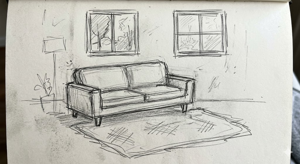
I had a rough pencil sketch of a living room — we’re talking 5-minute scribble energy, proportions slightly off, no textures, just vibes — and I uploaded it into PromeAI‘s Sketch Rendering tool.
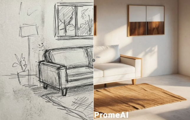
Thirty seconds later? A Japandi-style render with warm oak tones, soft diffused lighting, and a linen sofa that I would genuinely pay for.
I sat there for a solid minute just staring at it.
So today I’m walking you through the exact workflow I’ve been using — what makes a sketch “AI-ready,” the specific settings that actually work, and the honest mistakes I made so you don’t have to.

What Makes a Sketch “AI-Ready”
Here’s the thing nobody tells you upfront: PromeAI doesn’t need a perfect drawing. It needs a readable one.
There’s a difference.
Line Quality vs. Detail Level
AI rendering tools interpret your sketch as a structural map. Lines = architecture. The tool is asking: where are the walls, where’s the floor plane, where does light come from?
What actually matters:
- Clear room boundaries — your walls, floor, and ceiling junction should be visible
- Dominant furniture shapes — a rectangle for a sofa is enough; don’t stress the cushion count
- A sense of perspective— even a loose vanishing point helps enormously
What doesn’t matter as much as you think:
- Precise proportions (the AI adjusts within reason)
- Furniture detail (it fills this in from your style direction)
- Texture marks or hatching (these can actually confuse the render)
My working rule: if you can look at your sketch and immediately know it’s a room, PromeAI can work with it.
Phone Photo of Your Sketch vs. Digital Scan
I tested both. Extensively.
A phone photo works fine — but lighting is everything. Flat, even light. No shadows across the page. No glare. I use a basic LED desk lamp angled to the side when I shoot paper sketches. Shoot top-down, not at an angle.
A digital scan at 300 DPI is cleaner, but honestly? For PromeAI’s purposes, a well-lit phone photo at 1:1 crop is indistinguishable in output quality. Don’t overthink it.
One thing that does matter: crop tight to your sketch. Remove the blank paper border. PromeAI reads the full image frame, and empty white space can flatten the structural read.
Step-by-Step Render Workflow
Alright, here’s the actual process. I’m going to be annoyingly specific because that’s what I wish someone had given me.
Step 1: Upload and Set Strength
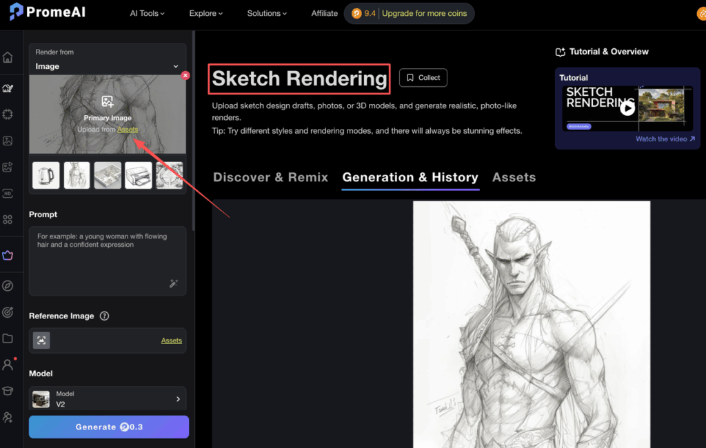
Go to Sketch Rendering in PromeAI.
Upload your sketch. You’ll see a Creativity Strength slider — this is the single most important setting in this whole workflow.
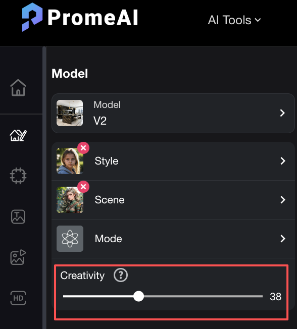
Here’s what it actually does:
- Low strength (20–35%): Stays very close to your sketch lines. Good if your structure is detailed and you want to preserve your layout exactly.
- Mid strength (40–60%): This is the sweet spot for most room sketches. It respects your structure but gives the AI room to add lighting, material depth, and spatial feel.
- High strength (65%+): The AI starts making its own decisions. Can produce surprising results. Occasionally produces a completely different room. Use when you want inspiration more than control.
I default to 45–50% for interior work. Almost every time.
Step 2: Choose Style Direction
This is where you communicate the feel of the space.
PromeAI has preset style options, but the text prompt field is where you actually direct the render. Don’t ignore it.
Prompts that work well for interior:
- “Japandi living room, warm oak tones, soft natural light, linen textures”
- “Contemporary kitchen, matte white cabinets, brushed brass fixtures, afternoon sunlight”
- “Maximalist bedroom, jewel tones, velvet, layered rugs, warm ambient light”
Prompts that get you generic results:
- “Modern interior”
- “Nice room”
- “Cozy living space”
Be specific about: lighting quality (soft, dramatic, diffused, directional), material feel (matte, glossy, raw, textured), and color temperature (warm, cool, neutral).
These three variables basically define how a render feels.
Step 3: Iterate with Region Edits
Your first render won’t be perfect. That’s normal. That’s part of it. What I do: generate the base render, then use Region Repaint to fix specific areas.
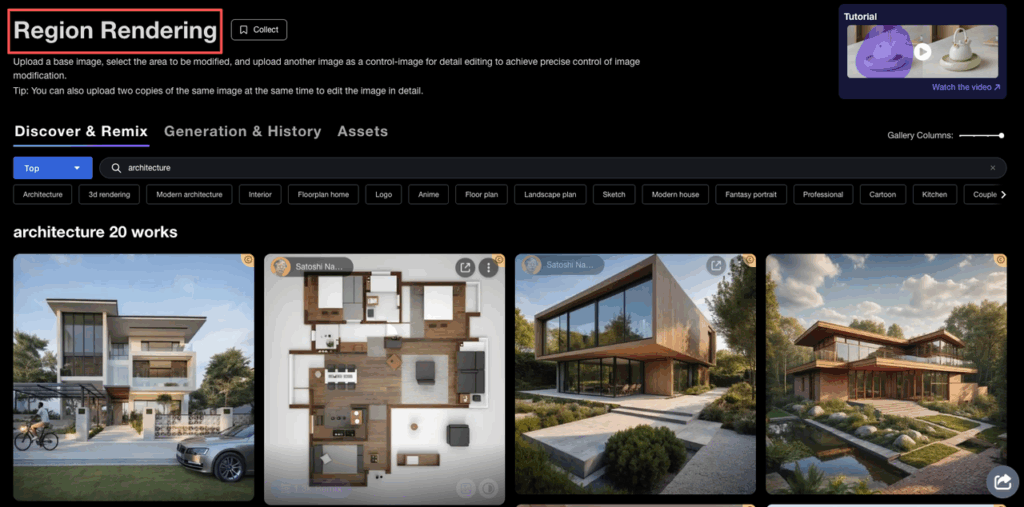
Common fixes I use constantly:
- Repainting the window area with a different lighting quality
- Fixing floors (wood grain direction gets weird sometimes)
- Replacing a generic couch with a more specific silhouette
Region edits are where PromeAI really saves time. Instead of regenerating the whole image and hoping, you isolate the problem area and repaint just that. Takes about 20 seconds.
Interior-Specific Tips That Actually Matter
Keeping Room Proportions
PromeAI can warp perspective slightly, especially in sketches with looser vanishing points. If proportion accuracy matters for your project (e.g., you’re presenting to a client with specific square footage), here’s what I do:
Draw a quick proportional grid in your sketch before uploading. Even two horizontal lines indicating floor/ceiling and a vertical centerline give the AI enough anchors to stay grounded. It’s a 30-second addition that prevents a lot of frustration.
Lighting Style Keywords
Lighting makes or breaks an interior render. These are the specific keywords I’ve found most effective in the prompt:
- “Golden hour raking light from left window” → dramatic, warm, directional
- “Overcast diffused light, no harsh shadows” → clean, editorial, neutral
- “Warm recessed lighting, evening ambience” → intimate, hospitality feel
- “Bright indirect light, airy, Scandinavian” → open, minimal, fresh
Don’t just say “good lighting.” Tell it where the light comes from and what time of day it feels like. That’s how interior photographers think about light. Turns out, it’s also how this tool thinks.
Common Mistakes (I Made All of These)
Uploading a sketch that’s too small. Anything under 800px wide produces muddy results. Scale up your sketch before uploading.
Overlapping lines at corners. Sketches where wall corners have a bunch of overlapping strokes confuse the spatial read. Try to keep corners clean — a single meeting point is better than a cluster.
Fighting the AI instead of guiding it. If the first render goes sideways, don’t just crank up the strength and regenerate. Change the prompt first. The prompt is driving style; the strength is driving fidelity. These are two separate levers.
Using high strength with a rough sketch. High creativity + low-detail sketch = the AI fills a lot of blanks with its own assumptions. Sometimes great. Often, not your room anymore.
No style direction in the prompt. “Interior design render” gives you the tool’s default interpretation of a nice room. Which is… fine. But it’s not your design language.
Before/After: 3 Real Examples
Example 1 — Living Room, Rough Sketch Input: 5-minute pencil sketch, one sofa shape, two rectangles for windows, a rough rug outline. Settings: Strength 48%, prompt: “Japandi living room, warm oak floors, soft morning light, minimalist” Result: Render nailed the spatial layout, added a beautiful low-profile sofa with linen upholstery, natural wood tones throughout. Had to repaint the ceiling — it added a beam that wasn’t in my sketch. Everything else? Kept it.
Example 2 — Open Kitchen Concept Input: Digital sketch, more detailed, cabinets indicated with basic rectangles, island centered. Settings: Strength 38%, prompt: “Contemporary kitchen, matte white and warm wood, pendant lights, late afternoon sun” Result: Very high fidelity to my structure. The AI added beautiful pendant lighting I hadn’t sketched and got the countertop material right. Floor was slightly off — did a quick region repaint and done.
Example 3 — Bedroom, High-Contrast Mood Input: Loose phone photo of paper sketch, bed placement, two windows, nightstands. Settings: Strength 62%, prompt: “Moody bedroom, deep navy, warm brass accents, ambient evening light, layered textiles” Result: The AI took more creative liberty here (expected at this strength), and it was worth it. Lost my exact window placement but gained a genuinely beautiful dark-toned render I ended up using in a client moodboard.
FAQ
Do I need a clean sketch or will rough work? Rough is fine. Readable is the requirement. If you can identify the walls, floor, and one or two major furniture pieces, the tool can interpret it.
Can I use a phone photo of my paper sketch? Yes — flat lighting, shoot top-down, crop tight to the drawing. Works well.
How much detail should my sketch have before rendering? Enough to define the room structure and dominant furniture shapes. You don’t need to draw cushions, plants, or accessories — the AI adds these from your style prompt.
Which PromeAI tool do I use for sketch-to-render? Sketch Rendering is your starting point. For region fixes after the first render, use Region Repaint.
Can I control the interior style after uploading? Yes, and this is underrated. Generate your base render, then use Region Repaint to adjust specific zones — change the floor material, window treatment, lighting quality. You don’t need to start over for every tweak.
The Honest Bottom Line
PromeAI’s sketch-to-render workflow is genuinely useful for interior design work. Not because it’s magic. Because it collapses the gap between idea in your hand and visual you can show someone.
That gap — rough sketch to client-presentable image — used to take hours of 3D modeling or Photoshop work. Now it’s a realistic 30-minute iteration loop.
It’s not replacing your design thinking. It’s just getting out of the way between your thinking and your showing.
Where do you usually get stuck in your visualization workflow? Drop it in the comments — I’m genuinely curious where the friction is for other designers, because I have a feeling we’re all tripping over different things.
Recommended Reads
Leave a Reply