
I have a confession.
Last Tuesday, I was supposed to finalize a concept deck by 6 PM. Instead, I spent 40 minutes scanning hand sketches and feeding them into PromeAI just to see what would happen.
What came out the other side? A render that looked like it had a proper visualization team behind it.
And the input was a pencil sketch on A4 paper.
That’s the thing nobody tells you about AI rendering tools — the input matters way more than the tool. So if you’re an architect sitting on a stack of hand-drawn sketches thinking “these are too rough to bother rendering,” this one’s for you.
Pencil Sketches as AI Input: What Actually Works

Let’s get honest before we get excited. Not every pencil sketch becomes a stunning render. The AI needs something to hold onto — structure, contrast, readable edges.
Here’s what separates the sketches that render beautifully from the ones that turn into abstract art:
Line Density and Contrast
PromeAI’s rendering engine reads your pencil lines as structural data. Light, wispy pencil strokes? The model sees ambiguity and starts guessing. Dark, confident lines? The model has something to work with.
What works:
- 2B or darker pencil strokes for primary structure (walls, rooflines, openings)
- Hard lines for load-bearing elements, softer for context
- Enough contrast between lines and paper that a photocopier would pick it up clearly
What doesn’t:
- Ultra-light construction lines with no buildup
- Sketches that are mostly tone and hatching with minimal outline definition
- Mixed media (pencil + watercolor wash) — the AI gets confused by overlapping information
The rule I use: if you squint at the sketch and can still read the building’s silhouette, you’re in good shape.
Scale and Resolution Requirements
The model doesn’t care what scale you drew at. It cares about pixel resolution once you’ve scanned or photographed the sketch.
Aim for a minimum of 1500px on the long side. For best results, go for 2000–3000px. Anything under 1000px and you’ll see the render compensating for detail that isn’t there — which usually means blurry textures or misread proportions.
If you’re photographing with your phone: use the back camera, shoot in natural daylight, keep the paper flat, and avoid harsh shadows across the drawing.
Preparing Your Drawing Before Upload
This step takes 5 minutes and makes a measurable difference in output quality. Don’t skip it.
Scanning vs. Photographing
Scanning wins, almost every time. A flatbed scanner at 300 DPI gives you a clean, evenly-lit, distortion-free image that the model processes more consistently. If you don’t have access to a scanner, a scanning app like Microsoft Lens or Adobe Scan does a decent job of correcting perspective and evening out lighting. Phone photographs work if the conditions are right — good flat light, no shadow, phone held directly above the paper. But they introduce lens distortion and uneven exposure that can confuse edge detection.
Contrast and Cleanup (Optional but Useful)
You don’t need to Photoshop your sketch into a crisp vector illustration. But a quick levels adjustment in any photo editor — bumping the whites slightly and deepening the blacks — can sharpen how the AI reads your linework.
If there are stray marks, crumpled areas, or paper texture that’s reading as false edges, a few seconds of cleanup will save you iterations on the render side.
Render Workflow: Step-by-Step
Here’s the exact workflow I run when taking a pencil sketch through PromeAI. No unnecessary steps.
Step 1: Upload and Select “Sketch Rendering”
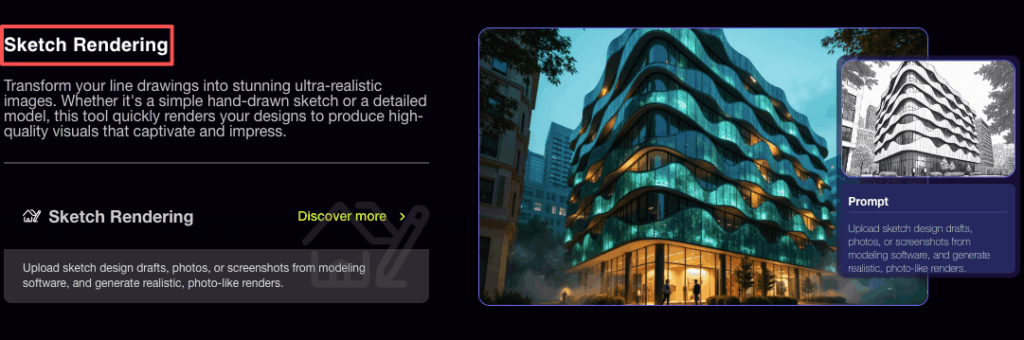
In PromeAI, go to Sketch Rendering (not Image-to-Image — that’s for photos). Upload your prepared sketch. This mode is specifically trained to interpret linework, which matters for pencil input.
Step 2: Style Selection for Architecture
This is where the render takes shape. PromeAI offers a range of architectural rendering styles. For pencil sketches, I’ve had the best structure preservation with:
- Realistic — good for early-stage massing studies where you need clients to read depth and scale
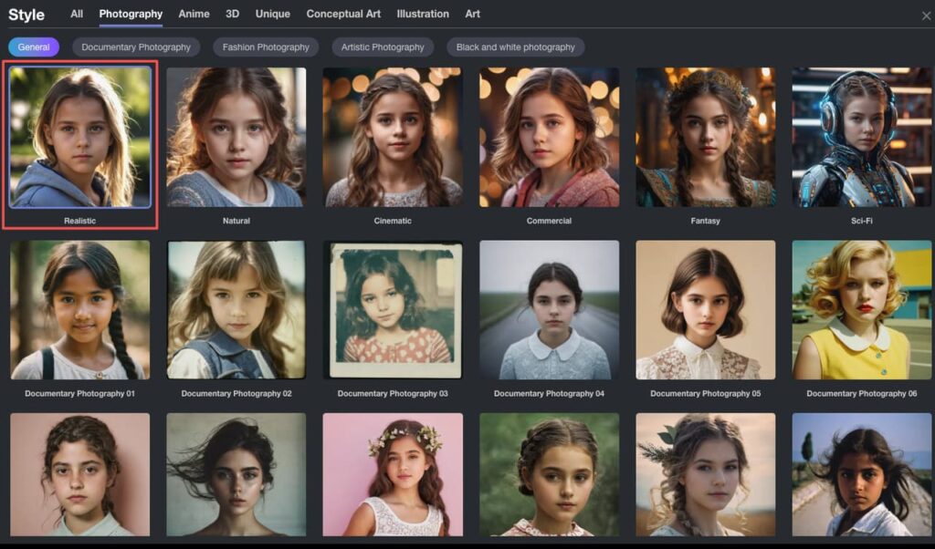
- Modern Architecture — works well for clean, rectilinear schemes
- Sketch Style — counterintuitively useful when the pencil lines are rough, because it blends the handmade quality into the output
Avoid hyper-photorealistic styles on very rough sketches. The AI will try to fill in detail that your lines don’t define, and the result often looks ungrounded.
Step 3: Controlling Structure Preservation
PromeAI has a Creativity or Fidelity slider (labeled differently depending on the version you’re using). This is the most important control for architects.
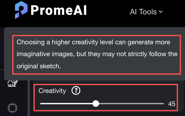
- High fidelity (low creativity): The render stays close to your drawn proportions. Use this for competition prep, client presentations, anything where the design intent needs to be legible.
- High creativity (low fidelity): The AI interprets freely. Good for early massing exploration when you want to see how a rough idea might develop.
I keep this at around 60–70% fidelity for most architectural sketches. It gives me a render that feels generated, not traced, while keeping the building’s geometry recognizable.
Step 4: Text Prompt (Don’t Overcomplicate It)
Add a short, specific prompt. Less is more. Something like:
Contemporary residential facade, natural light, afternoon sun from the left, white concrete, wood accents
You’re guiding atmosphere and material, not describing the building — the sketch does that. Don’t write a paragraph. 8–15 words is enough.
Material and Lighting Control After Render
Once you have a first render, PromeAI lets you refine without starting over.
Use the Repainting or Inpainting function to:
- Swap a facade material (concrete → brick) on a selected area
- Adjust a sky or landscape background
- Fix a section where the AI misread your sketch (common with rooflines)
For lighting, the text prompt does most of the work, but if you want directional control, specify it clearly: “hard shadow from upper right, golden hour light” gives you more than “nice lighting.”
3 Real Architect Scenarios
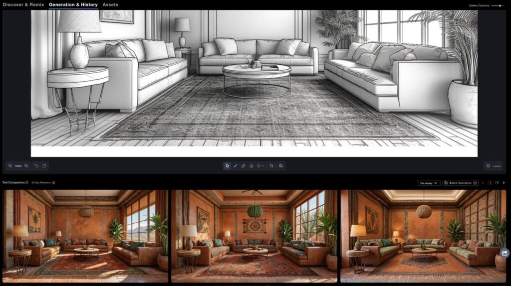
Scenario 1: Early-Stage Concept (You Have 20 Minutes)
You’re in a team meeting. Someone asks what the massing idea looks like as a building. You have a sketch on yellow tracing paper from this morning.
Photograph it, upload, select Realistic style, low creativity, minimal prompt. Run it. In 60–90 seconds you have something you can project on a screen and talk around.
This is PromeAI at its most useful — not replacing visualization, but moving a conversation forward.
Scenario 2: Client Presentation Draft
You want to show three facade options before committing to full Revit, Blender, or 3ds Max renders. Draw three variations at the same scale. Run each through PromeAI with the same style and prompt settings for visual consistency. Now you have a slide deck that reads as “considered options” rather than “rough sketches.” Clients respond differently to a rendered image than a pencil drawing, even when the content is identical.
Scenario 3: Facade Variation Exploration
You have a building in progress and want to test material combinations without rebuilding your model. Draw the facade elevation in pencil (or print your CAD elevation and draw over it). Run variations: brick vs. cladding vs. rendered finish.
This is where PromeAI’s iteration speed pays off. Five variations in an afternoon instead of five hours in a rendering engine.
Limits to Know Before You Start
This matters. Being honest about what doesn’t work saves you wasted time and wrong expectations.
PromeAI will not:
- Preserve exact window proportions from a rough sketch — if your windows are ambiguous, the render will guess
- Handle very complex rooflines drawn with light pencil accurately — high-pitched or intricate roof geometry often simplifies in the output
- Give you a construction-document-ready image — output resolution and structural accuracy are not at that level
- Replace visualization for high-stakes client deliverables where precision is non-negotiable
PromeAI works best when:
- The sketch has a clear primary silhouette and recognizable openings
- You want to explore atmosphere and material, not verify dimensions
- The output is for internal review, early client dialogue, or competition concept boards
- You’re willing to iterate — the second or third render is usually better than the first
Frequently Asked Questions
Q1: Does PromeAI preserve the original building proportions from my sketch? Roughly, yes — but the fidelity depends on your sketch clarity and your slider setting. High-contrast, well-defined sketches with the fidelity slider above 60% will preserve massing closely. Ambiguous sketches will be interpreted freely.
Q2: How dark or light should my pencil lines be for best results? Dark enough that you’d be happy photocopying the sketch. 2B or darker for primary lines. Construction lines should either be erased or kept very light so they don’t confuse edge detection.
Q3: Can I use soft pencil shading or only hard line sketches? Hard lines work best. Soft shading can be included for context (ground plane, sky) but shouldn’t define building structure — the model reads tone differently from linework and may misinterpret shaded areas as solid volumes.
Q4: What’s the difference between rendering a sketch vs. a photo in PromeAI? Sketch Rendering mode is trained to interpret linework as architectural structure. Image-to-Image reads existing visual information (texture, color, light) and transforms it. For pencil drawings, always use Sketch Rendering.
Q5: Is this useful for competition entries or only internal reviews? Both, depending on the stage. For early concept submissions or exploratory rounds, PromeAI renders are a legitimate fast-track tool. For final presentation boards in significant competitions, most architects use it as a starting point and refine in a proper rendering pipeline.
Where do you usually get stuck when translating a hand sketch into something presentation-ready? Drop it in the comments — I’m curious what part of the workflow still feels like friction.
Recommended Reads
Leave a Reply