
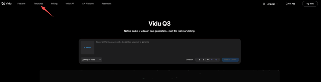
We all know the feeling: the client sends assets at 5 PM, needs a video by morning, and you’re staring at an empty screen with “blank timeline panic.” In the past, templates felt like a compromise—stiff, generic, and obviously pre-baked. But after putting Vidu Q3 Templates through the wringer on real client work, I have to admit: the game has changed.
These aren’t just pretty layouts; they are structural recipes for pacing and rhythm. However, using them blindly is a recipe for disaster (and rejected exports). In this post, I’m breaking down the best use cases for Story Mode, how to customize them so they remain on-brand, and the specific content moderation pitfalls that often trip up designers when they’re moving too fast.
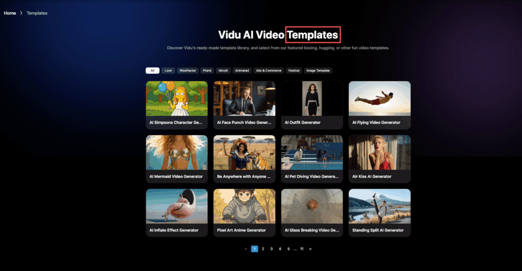
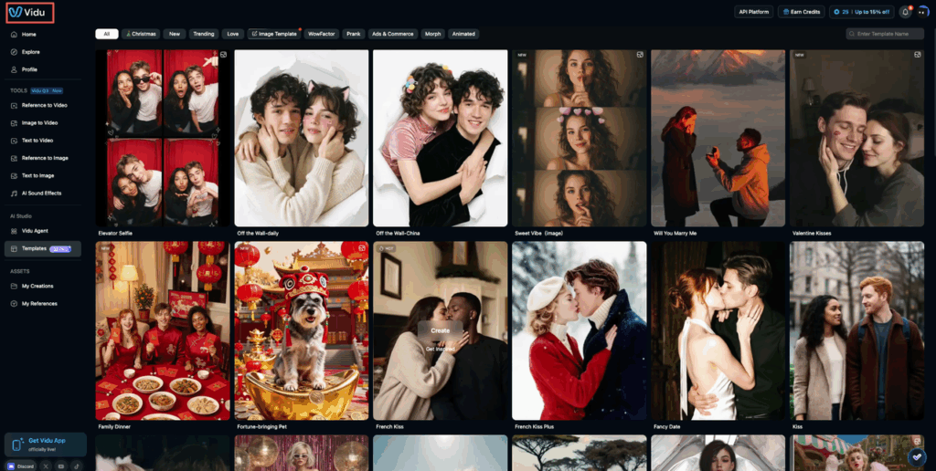
What templates/story mode are (and when to use them)
Templates (aka Story Mode) in some Vidu flows are pre-built video “recipes.”
Think: a ready-made sequence of scenes with timing, text placements, transitions, and sometimes audio pacing already chosen.
The best part isn’t the pretty layout, it’s the structure. When a template is good, it forces decisions:
- How many beats do we need? (3? 5? 7?)
- Where does the hook go?
- Where does the logo live so it doesn’t feel like an apology?
When we reach for templates
We use Vidu video templates when the goal is speed and we already know the rough message.
- Client changes at 5 PM: We can swap copy + shots without rebuilding timing.
- We have one hero asset: A single render, screenshot, floor-plan, or product photo… and need motion + rhythm fast.
- We’re testing variations: Same idea, different hooks. Templates make A/B versions feel consistent.
When we don’t
Templates aren’t great when:
- The story is genuinely weird (in a good way) and needs custom pacing.
- The brand system is strict and the template fights it (type scale, safe areas, motion rules).
In those cases, we’ll still start with a template… then treat it like scaffolding. Keep the scene count and timing, but redo the styling.
Vidu has set a standard for templates, but is it the right fit for your specific deadline? We invite you to A/B test your next project. Run the same prompt in PromeAI and compare the pacing, control, and output quality side-by-side.
Best template categories by goal (ads, memes, shorts)
We’ve tried enough templates now to notice a pattern: the “best” one depends on the job, not the vibe.
Here are the categories we keep coming back to.
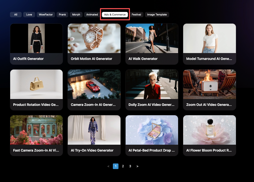
1) Ads (product, launch, event)
Pick these when you need clarity and a clean CTA.
What we look for:
- A hook scene with big type (readable on mobile)
- A mid scene built for feature bullets
- A closing scene with a CTA block (button-ish space)
Our quick ad formula:
- Scene 1 (0–2s): Problem or promise
- Scene 2–3 (2–8s): Proof (screenshots, renders, before/after)
- Scene 4 (8–12s): CTA + logo
2) Memes (culture moments, internal comms, “this is so us”)
Yes, even serious teams use these. Architects do it for competition weeks. Product teams do it for release notes. Marketers do it… always.
Good meme templates usually have:
- One dominant visual
- Hard cuts
- Big subtitle-safe areas
Tip: keep meme videos shorter than you think (6–9 seconds). If it’s funny, it’ll loop.
3) Shorts (educational, “3 tips,” process clips)
These are the templates that save us the most time.
They’re built for:
- Consistent beat pacing
- Clear text hierarchy
- A repeating layout that makes multi-part series easy
If we’re making a weekly series (design tips, behind-the-scenes, product updates), shorts templates are basically a style system for motion.
How to customize without breaking the template
This is the part where we used to get cocky and then wonder why everything suddenly looked… off.
Our rules now:
- Don’t change the scene count unless you have a reason. Templates are timed like music bars.
- Swap assets before rewriting timings. Replace visuals first, then see what’s actually broken.
- Keep the text length similar to the original placeholders. If the template shows 4–7 words, and we paste a 20-word sentence, it will look like a ransom note. The same issue appears when we draft copy with AI. Initial outputs can feel slightly stiff or overly structured, so we usually refine them until they sound natural or use tools that convert robotic text into human-like content before placing them into the template.
- Change one styling variable at a time:
- First: font (brand type)
- Then: colors
- Then: motion intensity
And a small thing that matters: keep your safe margins consistent. If the template was built for mobile-safe type, don’t push text to the edge just because it “fits.” It won’t in-app.
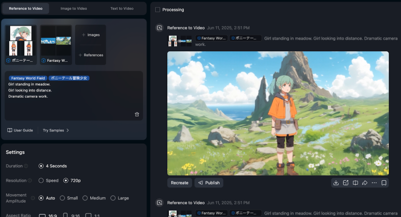
If your project involves multiple characters across scenes, it’s worth reading up on how to maintain character consistency in AI videos before you start—template pacing and character continuity need to work together.
Moderation gotchas (what triggers flags)
We learned this the annoying way: templates don’t protect you from moderation.
If anything, templates make it easy to crank out versions… and accidentally trip a flag because we copied the wrong line of text or used a spicy meme image.
Here’s what we’ve seen trigger issues most often (or cause a “why is this blocked?” moment):
- Celebrity names / lookalikes: Even “inspired by” can get touchy.
- Logos and trademark-heavy visuals: Especially if the template makes the logo huge and central.
- Medical/health claims: “Cures,” “guaranteed results,” before/after body stuff.
- Violence keywords: Even casual phrases can get flagged if paired with certain imagery.
- Adult content adjacency: Suggestive text + certain poses + certain outfits = surprise rejection.
What we do now:
- Keep prompts and on-screen text clean and literal.
- If we need an edgy joke, we test a private draft first.
- When in doubt, we rewrite claims as experience-based: “We noticed…” “In our tests…” not “This will…”
And we always check Vidu’s current rules when something changes. Policies shift over time, and you don’t want to debug a rejected export at midnight. Review the Vidu content moderation guidelines directly, and start from the official product page: Vidu Q3.
Quality controls (consistency, pacing, audio clarity)
Templates get us 70% of the way there. The last 30% is where it either looks “designer-made”… or like a template.
Here are the controls we obsess over.
Consistency (the #1 giveaway)
If scenes don’t match, viewers feel it even if they can’t explain it.
Our consistency checklist:
- Same crop logic: If scene 1 is tight, don’t go wide randomly in scene 2.
- Same color temperature: Don’t mix cool UI screenshots with warm lifestyle imagery without a grade.
- Same text hierarchy: One H1 style, one body style. Don’t improvise.
If the template uses text animations, we keep them consistent across scenes, even if we’re tempted to “spice up” one frame. For projects with more than one character, check out this guide on creating AI animation with 3 characters in 1 scene using multi-reference—keeping visual consistency gets significantly harder as cast size grows.
Pacing (make it breathe)
Templates often default to “fast, faster, FAST.” That’s good for ads. Bad for anything that needs comprehension.
What we adjust:
- If there’s an information-heavy scene, we add +0.5 to +1.0 seconds.
- If there’s a purely visual scene, we shorten it.
A simple trick: read the on-screen text out loud. If we can’t finish reading before the cut, we slow it down.
Audio clarity (quietly makes or breaks it)
Even a clean visual can feel cheap if audio is messy.
Our rules:
- Voice (if present) should sit on top. Music should support, not compete.
- Avoid harsh high-frequency tracks when there’s lots of text, your brain gets tired.
- If we’re using auto captions, we check for:
- correct punctuation
- line breaks that don’t split names or phrases
And if we’re publishing to social, we preview on phone speakers. Laptop audio lies.
Publish checklist
Before we hit publish, we run this quick list. It’s boring. It saves us.
- Hook check (first 1–2 seconds): Would we stop scrolling?
- Text check: No tiny type. No walls of copy.
- Brand check: Correct font, colors, logo spacing.
- Motion check: Transitions feel intentional, not random.
- Audio check: Voice clear, music not overpowering, captions accurate.
- Moderation check: No risky claims, no trademark-heavy visuals, no “edgy” keywords.
- Platform check:
- Vertical for Shorts/Reels/TikTok
- Safe margins for UI overlays
- Export quality looks good on a phone
If you want one extra credibility boost, add an author line on your post (especially if you’re a studio or a consultant). Something like: “Millie, AI explorer + designer who stress-tests new creative tools weekly.” It sounds small, but it builds trust.
Alright, where do we usually get stuck with Vidu templates?
Is it:
- picking the right template fast,
- keeping scenes consistent,
- or getting the pacing to feel “expensive”?
Tell us what’s tripping you up and we’ll share the exact workaround we’re using right now.
Frequently Asked Questions about Vidu Templates
What are Vidu templates (Story Mode) and what are they used for?
Vidu templates (often called Story Mode) are pre-built video “recipes” with a set sequence of scenes, timing, text placements, and transitions. They’re best for speed and structure—helping you decide the hook, beat count, and CTA placement so you can finish a video without rebuilding a timeline from scratch.
When should I use Vidu templates instead of building a video from scratch?
Use Vidu templates when you need fast, consistent output—like last-minute client changes, working from one hero image, or making A/B variations with different hooks. Skip (or heavily modify) templates when the story needs unusual pacing or when strict brand rules conflict with the template’s typography, spacing, or motion.
Which Vidu templates are best for ads vs memes vs Shorts?
For ads, choose templates with a strong hook scene, feature-bullet middle, and a clear CTA end card. For memes, look for one dominant visual, hard cuts, and big subtitle-safe areas—keep them around 6–9 seconds. For Shorts, pick repeatable layouts with clear text hierarchy and steady beat pacing for series content.
How do I customize Vidu templates without breaking the pacing or layout?
Keep the scene count unless you have a real reason—templates are timed like music bars. Swap visuals before changing timings, and keep text length close to the placeholder (4–7 words shouldn’t become 20). Change one styling variable at a time (font, then colors, then motion), and maintain consistent mobile-safe margins.
Why do Vidu templates sometimes trigger moderation flags, and how can I avoid it?
Vidu templates don’t prevent moderation issues; they can amplify mistakes at scale. Common triggers include celebrity lookalikes, trademark-heavy logos, medical “guaranteed” claims, violence keywords, or suggestive meme assets. Keep on-screen text literal, test edgy drafts privately, and rewrite claims as experience-based (“we noticed…”) instead of promises. Always refer to the official Vidu content moderation policy for the latest rules.
Recommended Reads
Leave a Reply